Design + Design Engineering
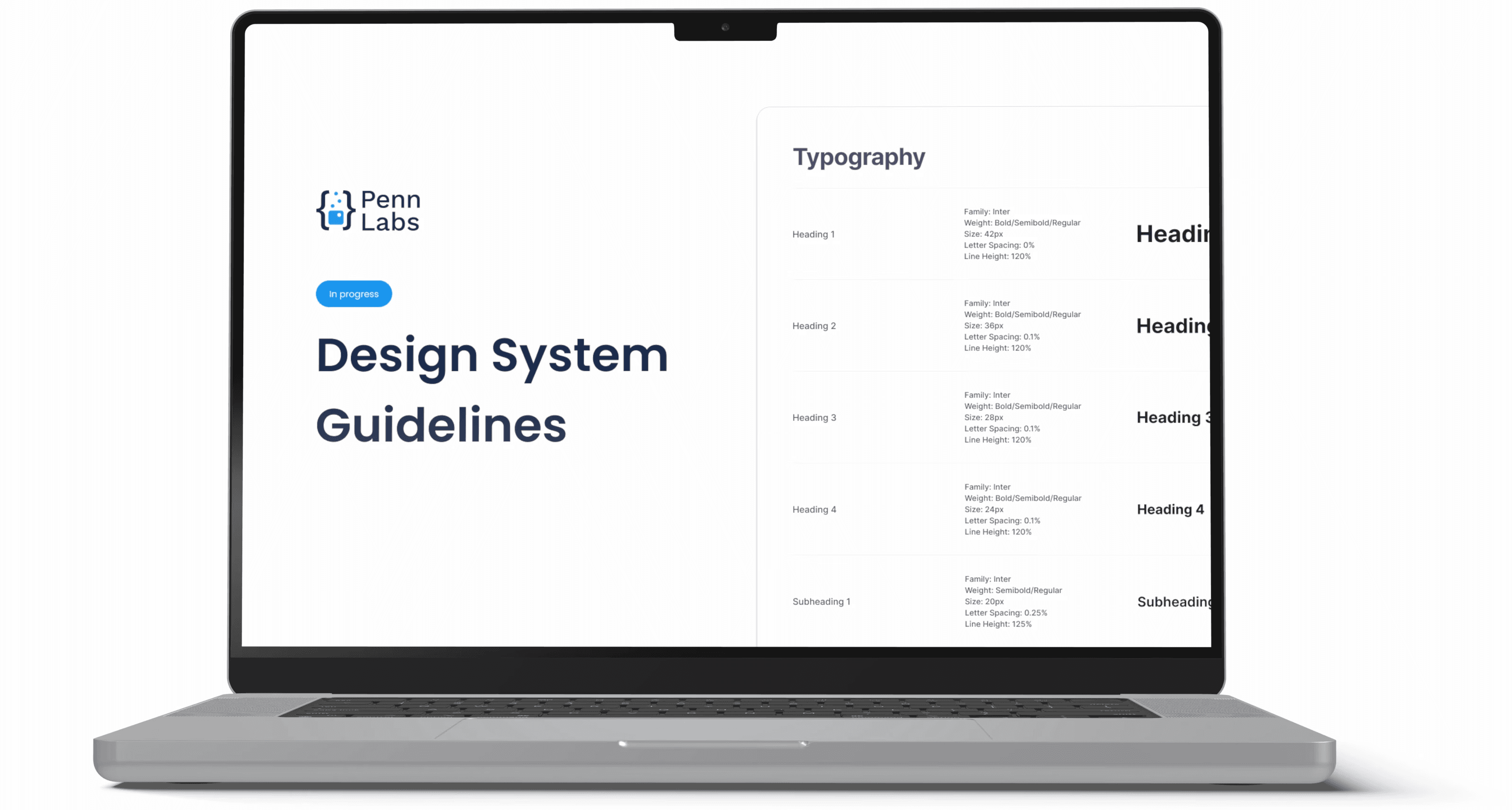
Penn Labs Design System
Building a design system for Penn's largest technology club, providing software to 80% of the university's population.
Process Highlights
Overview
Overview
Penn Labs is the organization which runs Penn Mobile, an application that 80% of Penn students use. Products are built by students for students.
Due to the massive inconsistencies between the different products Penn Labs offers, the design team set out to unify all branding and aesthetics of the products through a new design system.
This new design system is currently in being integrated into our products for Spring 2025.
Timeline
Fall 2024 to Spring 2025
Team
6 Penn Lab Product Designers
Penn Labs Products
Penn Labs offers 9 products to students and faculty


Research
Analysis
Penn Lab’s Current Designs
We knew that most of these products could not be rebuilt from the ground up. We therefore had to conform with some of the design decisions already made.
However, we knew our goal was to unify the product offerings under the same branding and aesthetic appeal.
Most of Penn Labs is also built on Shadcn, which meant we had to consider developer goals and preferences.
Designer Debt
Different components were not only looking different across products, but even across screens!
This was limiting our scalability and maintenance of our products long-term. We are a club, so students join and leave, meaning a well-maintained design system was absolutely essential for consistency.
Build scalable components
Unify design components across products
Clear documentation for developers
A designs system communicates the “what”, the “why”, and the “how”
The single source of trust, truth, and accessibility in a product.
Design Audit Across Penn Labs
Penn Course Review

Penn Clubs
Penn Course Planner

Office Hours Queue
Clear lack of design principles
Components varied across products
No consistency in aesthetic choices
Diving into the details
As we did a closer design audit, we saw some embarrassing inconsistencies across our offerings.


Lack of consistency and accessibility
Across screens in the same product, we noticed variations of the same component, which were completely different.
We had scaled too fast without a true design system
Penn Labs is a school club so people pass through every year - we needed a change to our design system such that these products could be maintained.
Too many designers, not enough of a framework
Components which represented the same meaning were different across screens and products.
Development
Building the Design System
The Audit
Penn Labs has accessibility and inclusivity at its heart, so we designed with these guidelines in mind.
This meant considering the small things, such as a system font, to the larger aesthetic choices of an inclusive design that is timeless.
We emphasized the atomic design philosophy system which allowed us to structure information hierarchies in an understandable fashion.
Building a design system alongside other teams
While building the design system, many other products were undergoing redevelopments.
Penn Course Review and Penn Portal were both in development. This meant iterating the design system while these two products were being built.
I loved the feedback loop as it made me consider the real world cases of our design choices in the guidelines.
Penn Portal
Penn Course Review
New Penn Labs Design System
Penn Course Planner
Define
The strategic planning, business needs, impacts, what Penn Labs “feels like” and “looks like”
Develop
Building the components in Figma, checking their feasibility with engineers, defining usage frequency and structure
Deploy
Launching the first version in Penn Portal and Penn Course Review, iterating upon the design system based on changes
We needed to know our goal when we set out to build the design system.
“Building products that Penn students can use to improve their daily life at the university”
Development
Documentation
Format
Our documentation was built for designers and developers, with an emphasis on clear delivery of information.
We want it to be easy to navigate such that we could make changes as a design team together.
Penn Labs Design System
Component Title
Lorem ipsum dolor sit amet, consectetur adipiscing elit. Phasellus vehicula, metus ut facilisis fermentum, arcu sapien tincidunt nunc, et posuere est erat sed turpis. Nullam vitae justo ac nunc interdum tincidunt.
Tip
Context for this component and what developers should know
Design Token Naming
Component / Sub-Component / State
Development
Color
Moving to only one primary color
Choosing a unified color palette versus maintaining distinct schemes for each of our nine products sparked significant debate within our team. Initially, each product had its own unique color identity, which users strongly associated with its distinct functionality and personality.
Consolidating into a single palette raised concerns that users might struggle to differentiate between products, potentially diluting each product’s unique brand equity. Yet, maintaining separate color schemes created a fragmented and less cohesive brand experience, making scalability challenging as the design system expanded.
The Penn Labs logo and primary brand color.
Penn Labs Design System
Colors
The Penn Blue is your go-to-color. Other accent colors should only be used sparingly for conveying state meaning and small accents in the product. A cohesive color palette across products builds trust.
Penn Blue
Accent Colors
Neutral
Black / White
Tip
Try to meet WCAG 2.0 accessibility standards for your text color choices.
Some of Penn Labs Product Brand Colors
4788F2
Office Hours Queue
2175CB
Penn Portal
4954F4
Penn Clubs
1E9CED
Penn Course Alert
858DD7
Penn Course Planner
84B8BA
Penn Course Review
Preserving Consistency
To preserve brand consistency while still supporting product differentiation, we strategically retained our full color palette but significantly constrained their application.
By clearly defining primary brand colors for interface-wide usage, and thoughtfully limiting accent colors to specific UI elements like data visualization or status indicators, we maintained visual cohesion across Penn’s products without t essential functionality or clarity.
Using Penn Blue for All Products, Instead of Specific Colors for Each
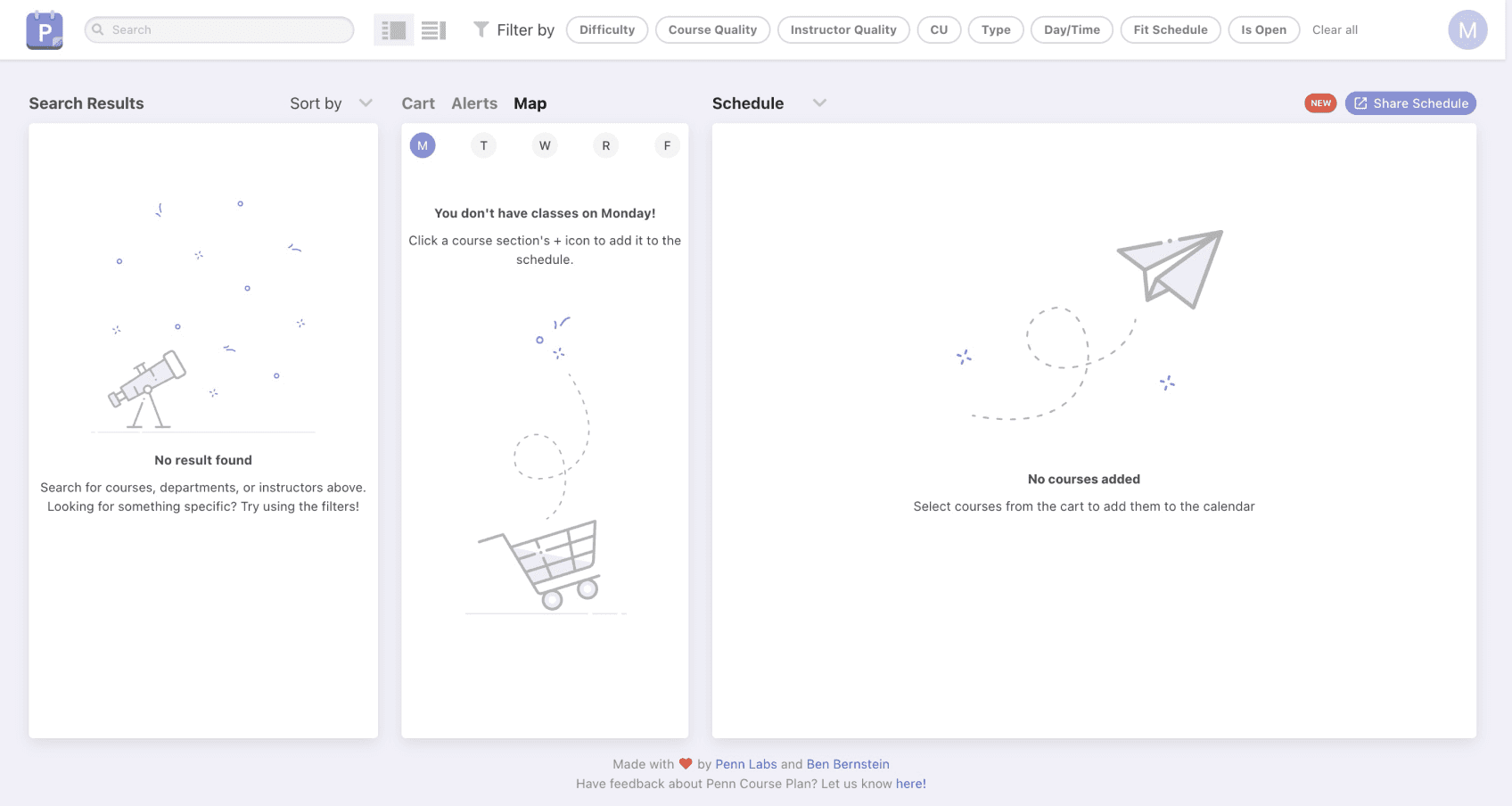
We carefully incorporated a diverse set of accent colors, purple, green, orange, and blue, to clearly communicate essential metrics like course difficulty, quality, and availability across our products.
For Penn Scheduling specifically, these colors were vital for distinguishing between various course offerings, enhancing usability and helping users quickly grasp key information at a glance.
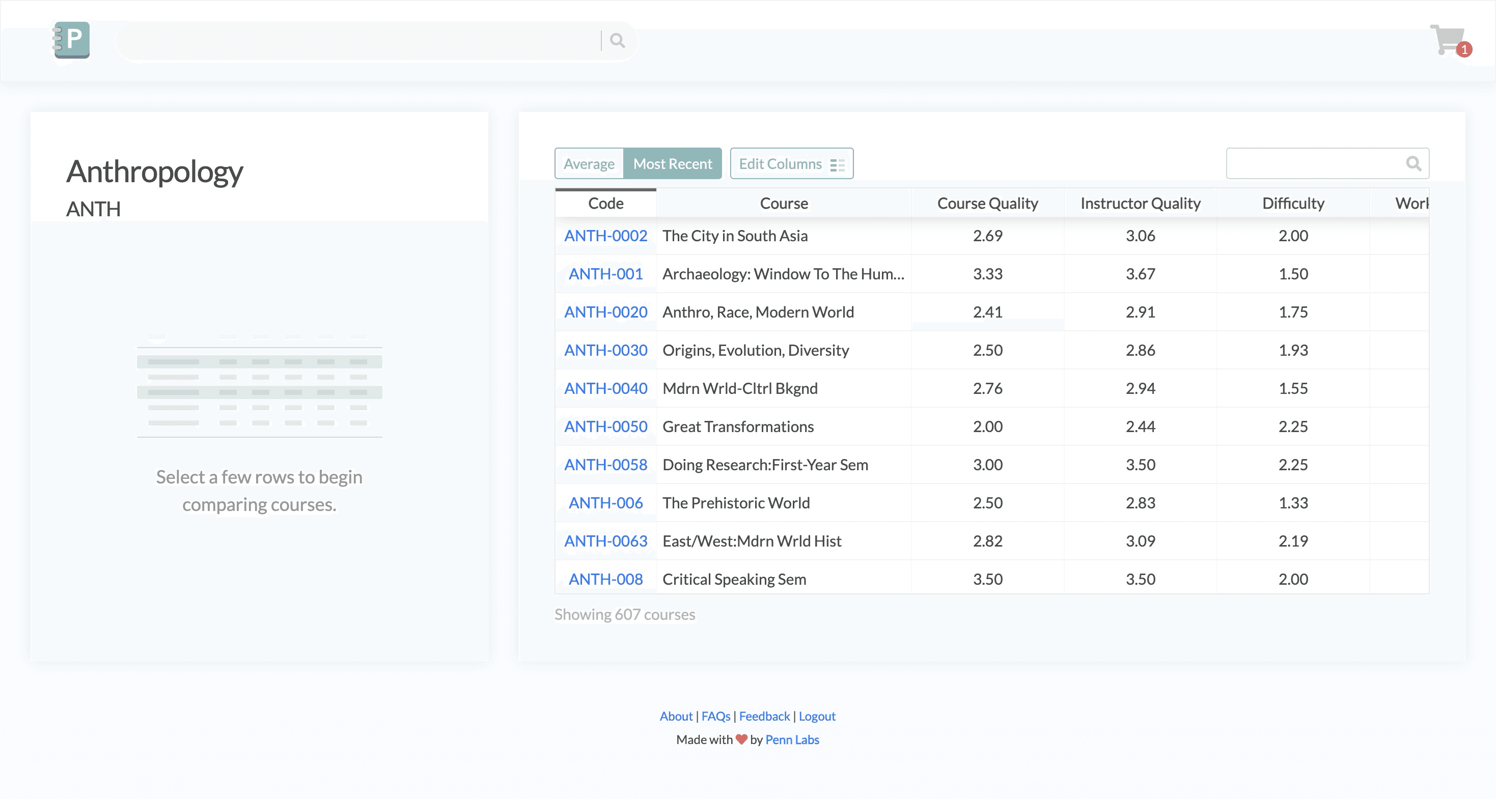
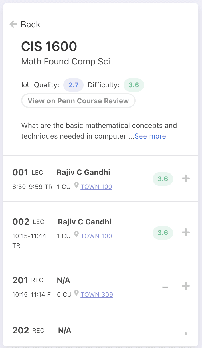
Experimenting and Iterating using Penn Course Review
As part of refining our color system, we conducted an experiment to evaluate whether relying solely on our brand’s primary colors could effectively communicate essential information like course difficulty and quality.
However, we quickly noticed that restricting ourselves to brand colors diminished the intuitive meaning previously conveyed through our varied accent colors. Users struggled to immediately understand critical metrics at a glance.
Overview
Selected Item
Average
5 Sections
Course Difficulty
3.1
Difficulty
1.2
Workload
Course Quality
2.8
Course Quality
3.1
Instructor
Course Description
Course Information
Penn Course Review using just brand colors
Overview
Recent
404 Sections
2.4
Course
2.4
Course
3.0
Course
2.4
Course
Average
404 Sections
2.4
Course
2.4
Course
3.0
Course
2.4
Course
Course Description
Course Information
Using a broader color scheme
Penn Labs Design System
Component Colors
The Penn Blue is your go-to-color. Other accent colors should only be used sparingly for conveying state meaning and small accents in the product. A cohesive color palette across products builds trust.
Backgrounds
Alerts
Development
Typography
Typography
Our team approached typography with careful consideration, knowing it would significantly shape the user experience and brand identity across our entire product ecosystem. One of our earliest challenges was selecting a system font that ensured broad accessibility.
This required extensive research into readability, visual clarity, and support for various languages and screen sizes. After exploring several options, we collectively decided on Inter, a highly versatile system font that satisfied our stringent accessibility standards.
Penn Labs is a product for everyone.
Inter
1% spacing
Typography
Heading 1
Family: Inter
Weight: Semibold/Regular
Size: 48px
Letter Spacing: 0%
Line Height: 120%
Heading 1
Heading 2
Family: Inter
Weight: Semibold/Regular
Size: 40px
Letter Spacing: 0.1%
Line Height: 120%
Heading 2
Heading 3
Family: Inter
Weight: Semibold/Regular
Size: 32px
Letter Spacing: 0.1%
Line Height: 120%
Heading 3
Heading 4
Family: Inter
Weight: Semibold/Regular
Size: 28px
Letter Spacing: 0.1%
Line Height: 120%
Heading 4
Subheading 1
Family: Inter
Weight: Semibold/Regular
Size: 24px
Letter Spacing: 0.25%
Line Height: 125%
Subheading 1
Subheading 1
Family: Inter
Weight: Semibold/Regular
Size: 24px
Letter Spacing: 0.25%
Line Height: 125%
Subheading 1
Subheading 2
Family: Inter
Weight: Semibold/Regular
Size: 20px
Letter Spacing: 0.25%
Line Height: 125%
Subheading 2
Body 1
Family: Inter
Weight: Bold/Semibold/Regular
Size: 16px
Letter Spacing: 0.5%
Line Height: 150%
Body 1
Body 2
Family: Inter
Weight: Semibold/Regular
Size: 14px
Letter Spacing: 0.5%
Line Height: 150%
Body 2
Caption
Family: Inter
Weight: Semibold/Regular
Size: 12px
Letter Spacing: 1.5%
Line Height: 150%
Caption
Iterations and Discussions
Equally critical was our goal to identify a typeface that could comfortably accommodate the diverse needs of multiple products within our system, from highly technical interfaces to playful marketing content.
Throughout multiple discussions, we realized the importance of a flexible font that harmonized effectively across diverse use cases, product teams, and emotional contexts. We conducted frequent team critiques and user tests to assess both aesthetic fit and practical usability, finally settling on a typeface that felt professional yet approachable, adaptable yet consistent.
Removing Bold and Constraining Letter Spacing
We tried using bold for our headers but after redesigning the banner for Penn Clubs, we found that semi-bold used throughout had better accessibility.
We also thought using a smaller letter spacing looked better, however its effect on accessibility weighed more important so we reduce our letter spacing again.
Development
Materials, Breakpoints
Shadows
Shadows should be used subtly and sparingly, reserved for highlighting elevation or interactive states, to gently guide users without overwhelming the interface or detracting from the design’s overall clarity and simplicity.
Grids
A disciplined, systematic grid ensures rhythm, alignment, and visual harmony, empowering designers to create seamless, scalable experiences that feel intuitive and polished across every screen.
Breakpoint
Class infix
Dimensions
Small
sm
< 768px
Medium
md
< 1200px
Large
lg
< 1400px
Extra Large
xl
> 1400px
Penn Labs Design System
Layout
For larger size screens, increase the gutter size but maintain the over grid placement.
Tip
Try to incorporate fluid dynamics into your designs for better layouts.
sm
Margin: 16px
Gutter: 16px
md
Margin: 32px
Gutter: 16px
lg
Margin: 40px
Gutter: 16px
Grids & breakpoints
Great interfaces rely on precision and consistency across devices - this is where intentional breakpoint selection and robust grid layouts come into play. Breakpoints shouldn’t simply respond to device sizes, but thoughtfully anticipate user context, fluidly preserving content hierarchy and readability.
Consistency across screens
A disciplined, systematic grid ensures rhythm, alignment, and visual harmony, empowering designers to create seamless, scalable experiences that feel intuitive and polished across every screen.
Development
Buttons, Dropdowns, and Segments
Scalability vs. Customization
In our design system, we balanced scalability and customization by using a base button component with predefined variants (primary, secondary, ghost). While this ensured consistency, we allowed controlled overrides for edge cases, preventing unnecessary deviations that could fragment the system’s visual identity.
Accessibility vs. Aesthetic Flexibility
We prioritized WCAG-compliant contrast ratios and focus indicators, even when aesthetics favored subtler styles. This meant carefully crafting color palettes and interaction states that were visually appealing but still met accessibility standards, ensuring an inclusive experience without sacrificing Penn Labs’ design language.
Penn Labs Design System
Buttons
Use predefined button variants to ensure consistency. Customize only when necessary to maintain accessibility, scalability, and design system integrity.
Tip
Maintain contrast, focus states, and consistency.
Button
Button
Button
Button
Stateless
Hover
Selected
Disabled
Stateless
Stateless
Hover
Hover
Selected
Selected
Disabled
Disabled
Stateless
Hover
Selected
Disabled
Stateless
Stateless
Hover
Hover
Selected
Selected
Disabled
Stateless
Stateless
Hover
Hover
Selected
Selected
Disabled
Disabled
Stateless
Hover
Selected
Disabled
Disabled
Stateless
Hover
Selected
Disabled
Filled
Outline
Icon
Text Icon
Text
Button
Button
Button
Button
Button
Button
Button
Button
Button
Button
Button
Button
Button
Button
Button
Button
Button
Button
Button
Button
Button
Button
Button
Button
Button
Button
Button
Button
Button
Button
Button
Button
Button
Button
Button
Button
Icons with buttons should be used sparingly
Consistency in roundness of corners is critical
Penn Labs Design System
Inputs, Dropdowns, Segmented Control
Dynamically resize based on breakpoint sizes
Tip
Ensure that active states aways have Penn Blue stroke.
Icon
Placeholder
Placeholder
Default
Selected
Disabled
Text
Default
Text
Selected
Text
Disabled
Default
Placeholder
Placeholder
Default
Selected
Disabled
Special
Placeholder
Placeholder
Default
Selected
Disabled
Dropdown
Segmented
Segmented
Right Selected
Selected
Selected Item
Item
Selected Item
Left Selected
Unselected
Item
Selected Item
Item
Development
Headers, Menus, Cards
Consistency vs. Flexibility in Headers
With nine products and multiple device types, our headers needed a unified structure while accommodating different functionalities like search, cart, and navigation. We established a core layout with modular elements, ensuring visual consistency while allowing conditional rendering for features that varied across products.
Scalability vs. Clarity in Cards
Cards served diverse functions - course planning, reviews, and scheduling, requiring a flexible yet clear structure. We designed adaptive layouts with dynamic content slots, ensuring scalability without overwhelming users. Careful use of hierarchy, spacing, and typography kept complex data readable while maintaining a cohesive UI.

Menus should be intuitive, scalable, and accessible, adapting seamlessly to different navigation needs across products and screen sizes.


Development
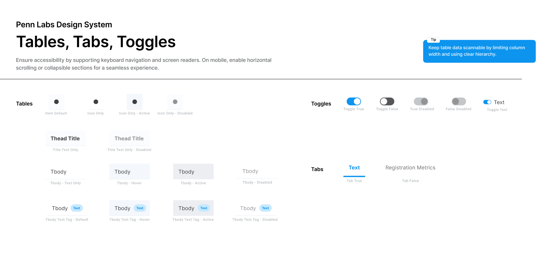
Tables, Tags, Toggles
Tables: Balancing Density and Readability
Tables in our system needed to handle large datasets while remaining scannable across devices. We used striped rows, responsive stacking, and inline filters to enhance clarity.
Tabs: Organizing Content Without Overloading Users
Tabs helped segment complex workflows into digestible sections while maintaining quick access to key features. We designed them with clear labels, adaptive widths, and persistent states for usability. On mobile, swipe gestures and dropdown alternatives ensured seamless navigation in space-constrained layouts.
Conclusion
Takeways
Takeaways
Through this project, I learned that a strong design system is built on thoughtful trade-offs between brand cohesion and functional clarity. Navigating team debates around typography, color scalability, and interface consistency deepened my appreciation for designing with intentionality and systems thinking.
Importance of Iteration
This project also taught me the importance of iterative experimentation and cross-functional communication. By conducting tests- such as evaluating the effectiveness of color as a functional tool - and incorporating feedback from engineering and design peers, I developed stronger skills in collaboration and decision-making.
Prioritize system scalability
Simplify color choices
Typography drives consistency
Experiment, then iterate