Prototype - Mixed Reality
Process Highlights
Design Overview and Challenges
Overview
I developed a mixed reality design system that enables faster and more seamless navigation through user interfaces in 3D environments. By enabling more control in spatial interfaces for users, productivity and usability for these devices improves.
Process Highlights
Project Information
Timeline
June 2024 - July 2024
Skills
Figma, Photoshop, After Effects, Unity
Research
Design Systems for 3D Experiences
The Current Landscape
Since the AR/VR world is accelerating and improving so fast, design systems quickly fall out of date as the technology outpaces the development of interfaces. Moreover, as headsets become more affordable and mainstream, the UI must improve to enhance user productivity and accessibility.
Mobile and Desktop Heuristics
Most of the current design systems for spatial computing devices are still based on mobile design heuristics, as they are intuitive to the first time user moving from the 2D world into the 3D world. However, as this technology becomes more popular, it is time to rethink the design systems we currently use.
Better, Newer Tech
In order to make AR/VR technology mainstream and popular, users must recognize its advantage over current 2D devices. Thus, it is important that the interfaces of spatial environments can compete on metrics of productivity, usability, and accessibility so the switch to this new form of tech is advantageous.
Research
So… The Main Problems:
Current AR/VR Design Systems Have…
Slow navigation due to painful control systems
Design based on 2D heuristics which sacrifice innovative interactions
Limited user accessibility due to gestural limitations
The Main Pain Points:
What are the main problems with current design systems?
Slow Navigation
Current interfaces are based on point and pinch or touch interactions. These gestures are extremely limiting. Point and pinch requires the user to only have binary interactions, when usually our bodies act more dynamically. A major reason for this limitation has been the current state of technology, although this is improving fast.
Lack of Gestural Interactions
On desktop devices, the user inputs are dynamic. A keyboard provides fast interactions with a system, and a mouse gives a range of precision and actions it can enter into the interface. On mobile, the gestural interactions are even more broad due to the precision and fluid movement of fingers. How can we use these fluid movements in the 3D space?
2D Design Heuristics
Unaesthetic Designs
Some design systems for 3D environments are rushed in development since the tech is accelerating so quickly. This can lead to design systems which are ugly, and sacrifices a delightful experience for the user.
Research
Developing a Solution
The Main Philosophy
AR/VR interfaces should never hinder the user’s productivity, accessibility, or experience with the new technology. This means a fine balance between intuitive heuristics based design and innovative interactions must be found. A user should not feel overwhelmed nor limited.
Understanding the User
There is no doubt that when a person first tries an AR/VR experience, they are blown away. It is novel and interesting to use a device that can augment your reality. However, it is important to always put real life at the forefront - how is your cousin, your friend, your teacher, etc going to use this device? Is it useful for them? Does this tech really make sense for everyone?
Design Goals
Enable seamless interactions with UI
Swift navigation that promotes efficiency and productivity
Minimalistic design that improves accessibility
Utilizing gestural interactions as an innovative feature for enhanced user experiences
Ideation
Moodboard
Considering What Already Exists
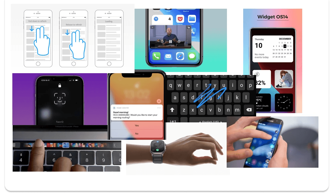
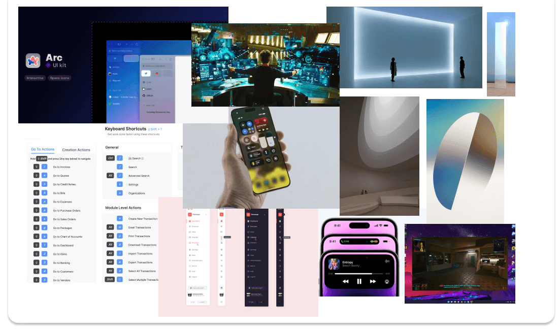
I research different 2D software and their designs in order to utilize the best features and interactions. What could be translated best into the 3D environment? What were the interactions that improved efficiency and productivity the most in our mobile and desktop devices?
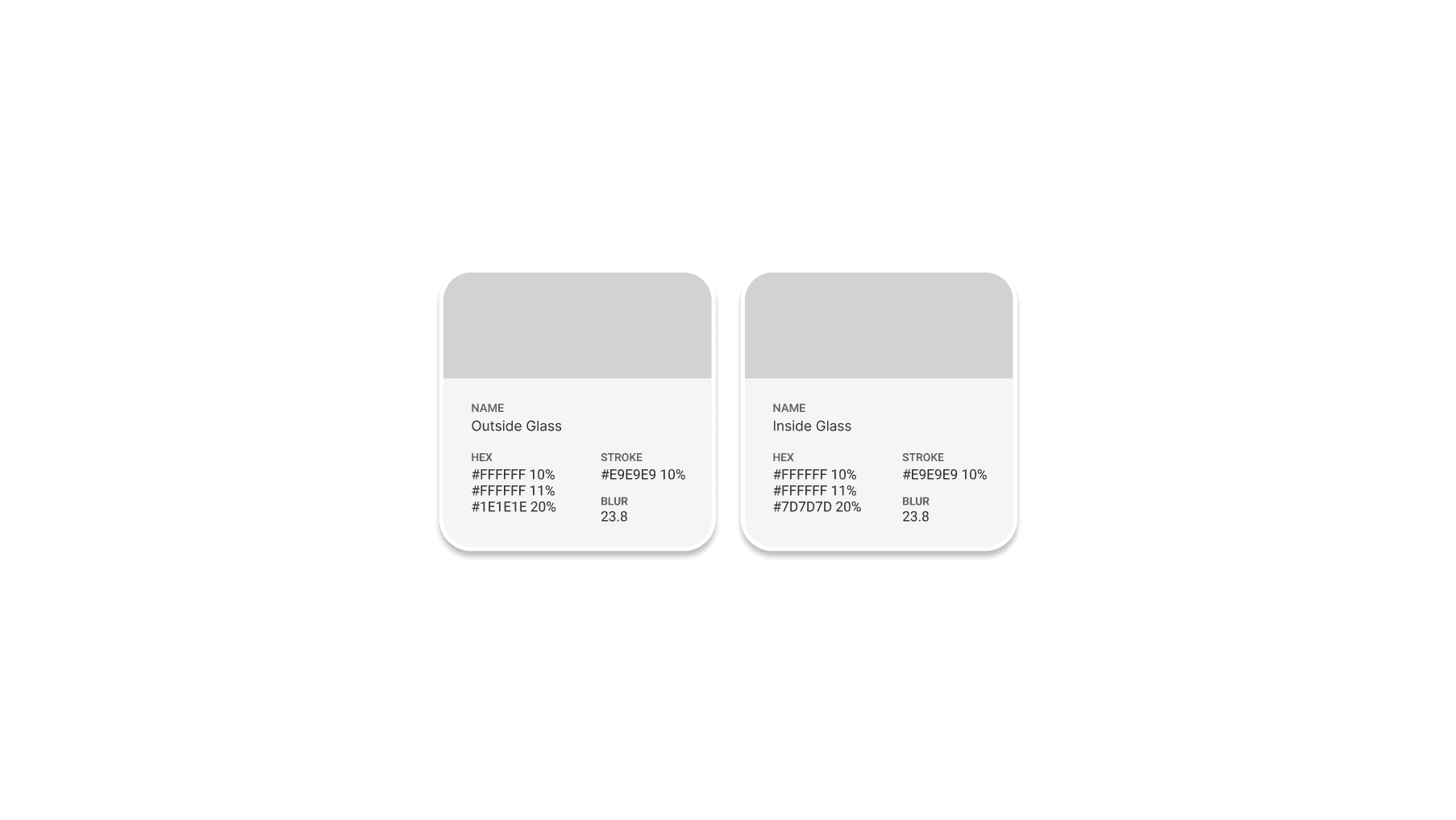
Glassmorphism based design style. However this is dependent on the engine building software.
FaceID, pull to refresh, interactive notifications, widgets, picture in picture, etc
Light and space movement, toolbars, navigation, dynamic island, whole body controls
Ideation
Low Fidelity
Low Fidelity Phase
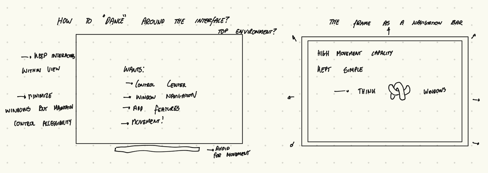
Here are the preliminary ideas about how navigation can work in this design system. These low-fidelity ideations start developing a concept of movement in the UI, and how it can best be used to help the user interact more naturally.
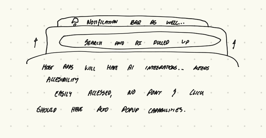
With AI agents becoming more ingrained in our apps, I felt that there needed to be a centralized, ubiquitous location to find an input field.
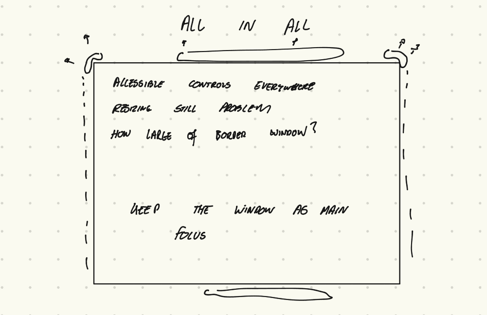
The goal is to have accessibility to everything all in one location. The same way your phone is a frame that has controls all around its edges, the window in AR/VR experiences should be the same.
I decided that the corner design style was too confusing with resizing controls. By placing everything inside the frame, the window become more dynamic and the controls were centralized.
Ideation
Mid Fidelity
Mid Fidelity
This stage was focused on understanding what the design system would look like with this core focus on movement. How would the features be positioned and interacted with in order to improve user efficiency, productivity, and usability.
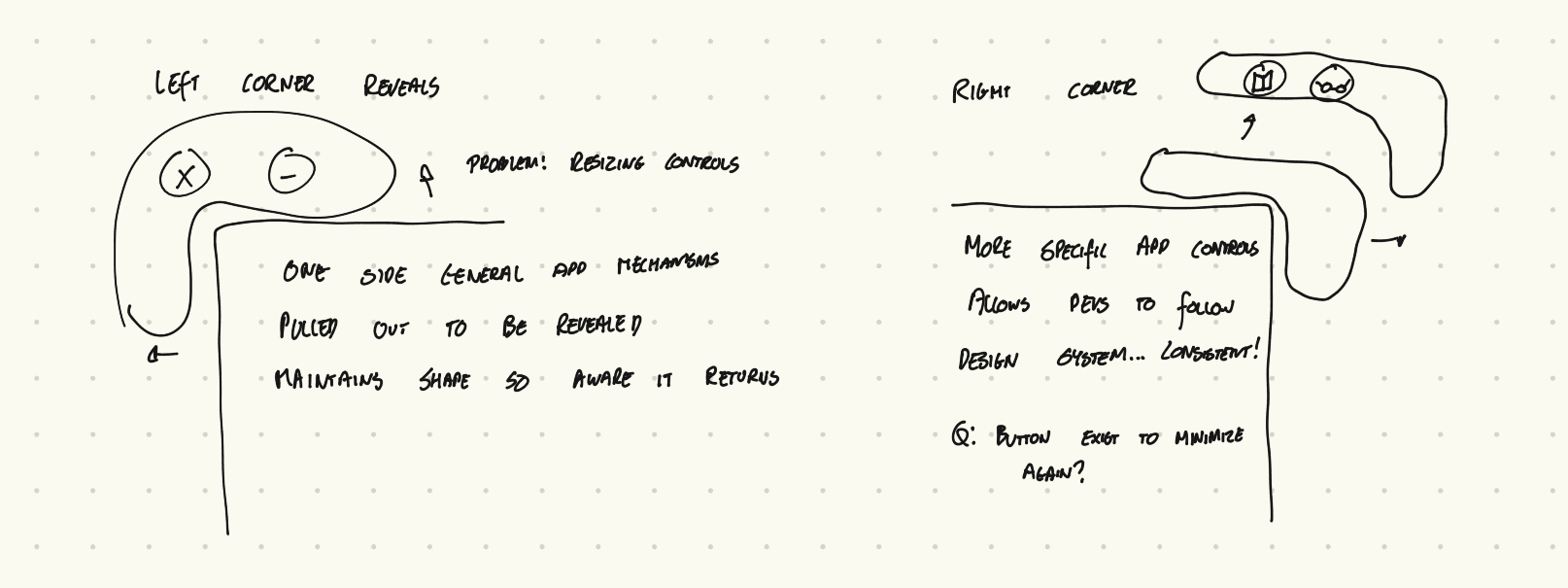
At this point I was trying to understand where controls would live. Controls in the corners and on the sides.
I still was hung up on the idea that users would need guidance that there were controls hidden in their window. However, I was still stuck with a problem: these guides looked like resizing controls.
I experimented with different ways these guides could look - although none seemed to fit. They all had their own problems, and most of all, they were ugly.
I decided to remove the guides and focused on the border window instead. I knew it would sacrifice possible intuitiveness for the user, although there needed to be a change in the way we use spatial UI. If people could get used to knowing that a control center is called from swiping down on their phone, could they adapt the same way in AR/VR environments?
Mid-Fidelity Prototypes to Understand Movement
By placing the navigation bar on every window, the user has more accessibility.
Controls that aren't in your face.
Search and AI fields that pop-up.
Ideation
High Fidelity
High Fidelity
This stage was primarily focused on animations and actually using dynamic interactions. I investigated to find out what movements both felt natural and were quick enough to help the user “dance” through the UI.
Demonstrating having the navigation bar on every window.
Easy swipe on the top left panel, or pinch and point.
Apps can integrate important features in the border of the window.
At the user's fingertips.
Although windows can exist in 3D spaces, split screen windows provide more productivity.
Ideation
Design Decisions
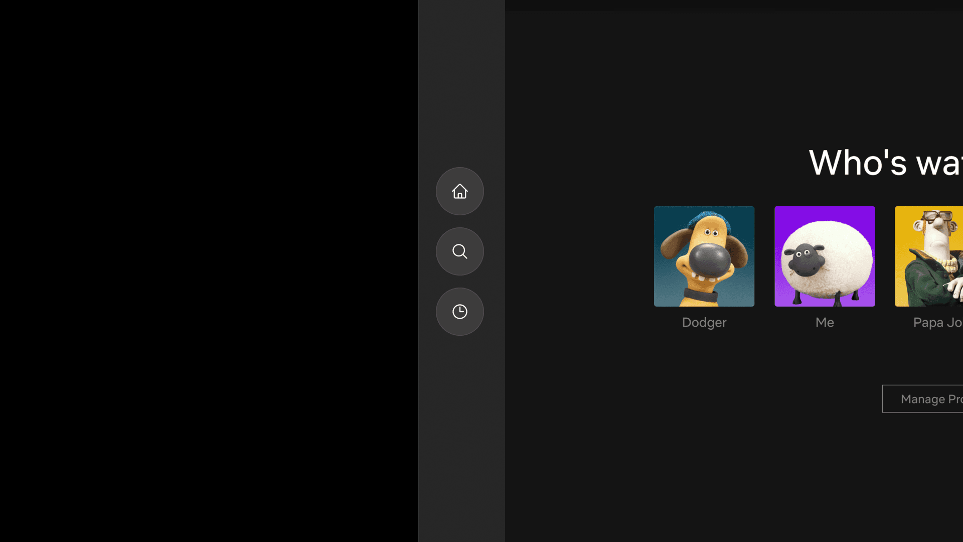
By creating a navigation bar on every window, the user is free to access their features wherever they are. There is no need to search for a navigation bar in your environment, nor keep all windows in a specific space centered around the navigation.
By allowing the user to hide and show key functions, the amount of visual clutter in your environment is reduced. This is important in spatial environments, especially AR experiences, as window size interferes with the user’s view of their surroundings.

This design system also encourages apps to utilize these hidden buttons on the window for important interactions. These buttons are faster to access and also allow the user to not interrupt their current workflow. Developers also have a framework of where to place controls.
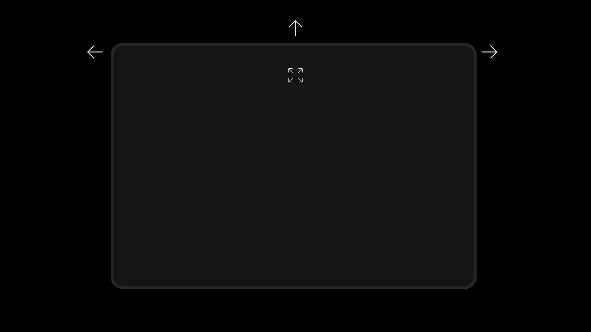
By use of pulling, swiping, and gestural interactions, the user has many ways of interacting with the UI. Gestures are far more efficient than point and pinch interactions, as they allow for the user to speed up their workflow. It is faster for the user to close and open apps, navigate to new apps, and access in-app features.
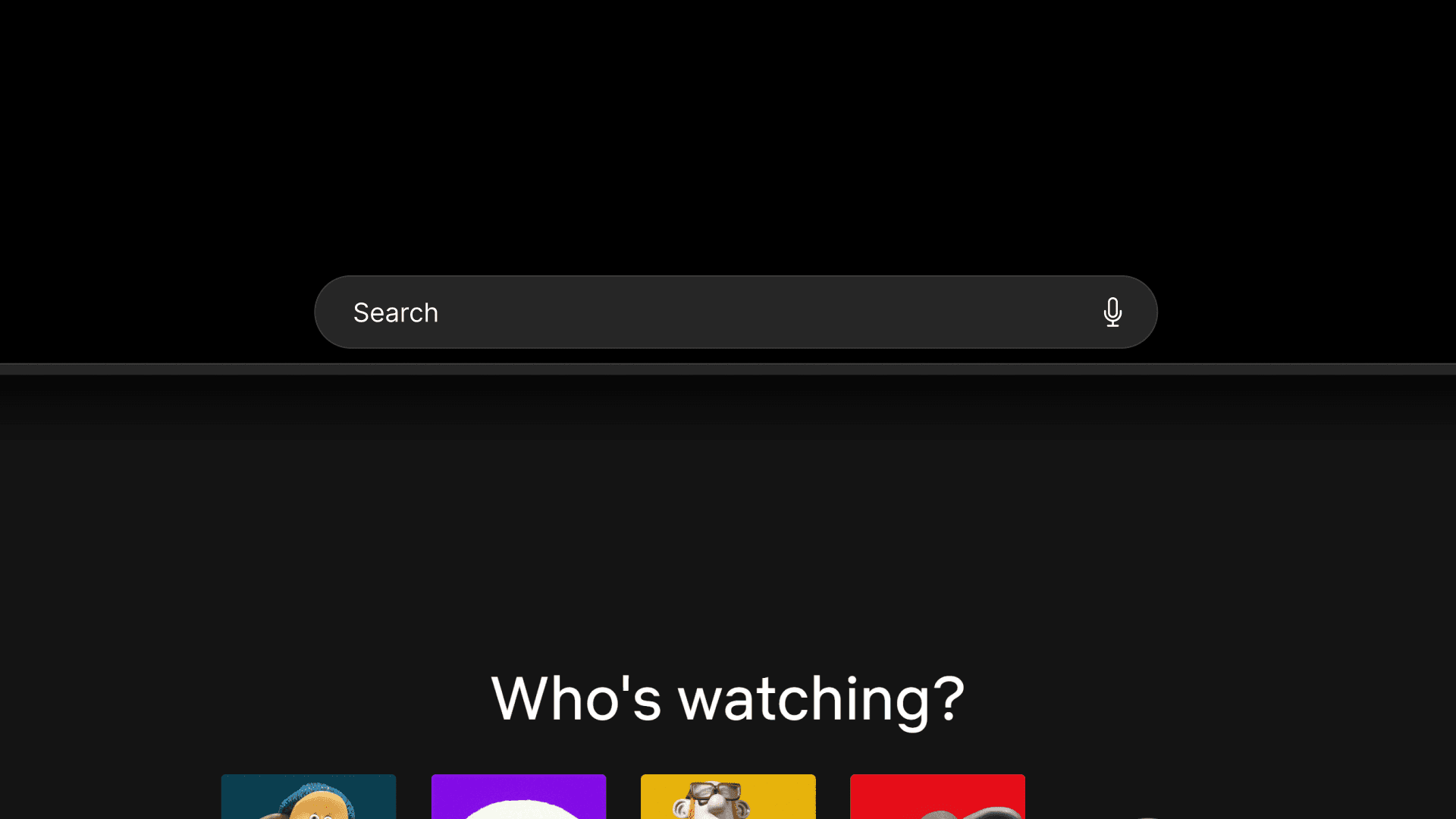
Notifications are now built into apps through this design system, which means that UI on spatial computing devices have a centralized place to view these alerts. The user now does not have random pop-ups in space, and can access their notifications whenever they need to.
As AI becomes more integral to our lives, we will be accessing these agents more frequently. This design system integrates AI interaction fields into each window, allowing the user to quickly call up their app’s intelligence.
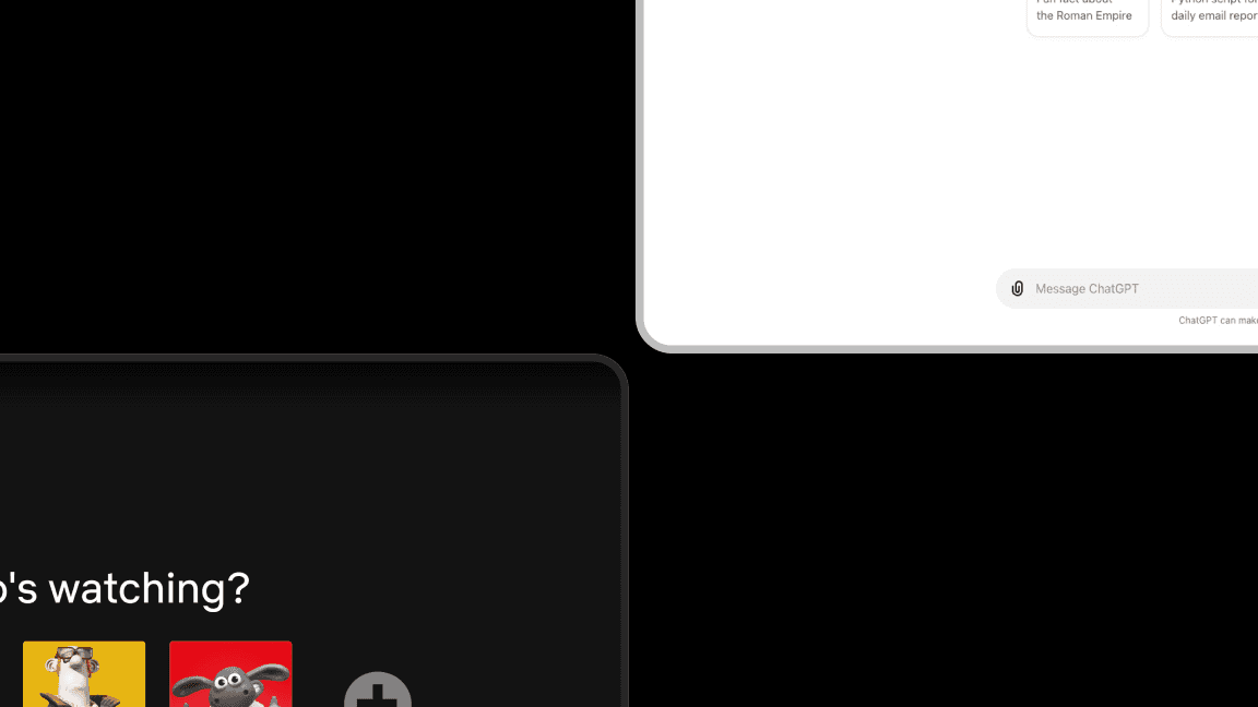
With this design system, apps are free to customize. Light mode, dark mode. Any color developers want.
Prototype
Prototyping in Unity
Prototyping the app design using various gestures and actions
Demo in Quest 3
User has access to navigation controls on every window.
Difficulty in understanding the controls for first time users.
Users can bring the controls to them if it is difficult to be accurate with a point and pinch.
Limits the user's view of their surroundings in AR experiences.
The only time you want to see the minimize and exit controls are when you're using them. Otherwise, they should just disappear.
Intuitiveness, again. One of the most frustrating things for a user is being unable to close a window because the controls are hidden.
Conclusions
Main Takeaways
This project was extremely difficult for me as I had to think outside of the box - literally. It was very hard to think creatively about ways an OS can look, since most of the time we design inside of these constraints.
This project required me to feel comfortable in my own perspective of how design systems should look and operate - a challenge in itself.
In order for these designs to come to life, they need to be built. I had to remember that developers face constraints and design accordingly.
Technically, I made sure that this project could be possible to implement on a large scale, through using my own knowledge of programming. "If I were a developer, how mad would I be at my designer?".
I wanted to keep exploring interaction states in this design system. How would a point interact with the window? How would I show hover states, etc.
I wanted to make a package that could be used as a toolkit for developers following this design system. This would be the best way to get real user feedback about my idea.
Thanks for checking it out!
