Prototype - Mixed Reality
Process Highlights
Design Overview and Challenges
Overview
The control center, or quick settings, act as a centralized user interface where users can access and manage essential functions without the need to navigate multiple menus. This emphasis on access to essential functions without multi-interaction is helpful in improving productivity, maintaining immersion, and saving time. I am to redesign the control center for a 3D environment, with an emphasis on accessibility and comfortable interactions.
Process Highlights
Project Information
Timeline
June 2024 - July 2024
Skills
Figma, Photoshop, After Effects, Unity
Research
The Problem with Controls Centers (Quick Settings) in 3D
Rethinking Quick Settings for Spatial Environments
Control centers are ubiquitous in most products, as they provide efficient access to key functions that are subject to change frequently. However, in the realm of spatial computing and 3D environments, control centers must be rethought under a new design paradigm.
Comparing 2D to 3D
Control centers on desktop and mobile emphasize quick interactions, with fast opening and close times. This minimizes the amount of time a user spends in changing their settings. In 3D environments, its the same - nobody wants to do three interactions to change the wifi.
What Works in 2D is Often Skewed in 3D
The problem with control centers in VR/AR environments is that they are designed from a 2D bias, utilizing principles which work best for a flat environment. Translating a design language from these 2D interfaces allows the user to not feel overwhelmed with new interactions, although it sacrifices possible innovation in user efficiency.
Research
Control Centers in 3D
The Current Problem
Most control centers for immersive experiences affect the user’s capacity to remain in their environments, and often require opening a new window or pausing the current user’s process. Not to mention, these pop-ups are slow and require multi-interaction.
Slow Interactions
Calling control centers in 3D is slow, as they are usually unintuitive and require a large window pop up. Although this allows for a familiar 2D window for the user, it requires slow deliberation in interacting with the functions.
Broken Immersion
Since most of these control centers are window based pop-ups, they break immersion for the user. For 2D control centers, these interfaces are small and quickly interacted with. This is not the case for spatial environments, as they often are difficult to call/close.
The Case for Gestures in Calling Windows
Gestures have been a controversial topic in the XR realm, as they are a new medium which users have to learn. However, I argue that gestures are required to push innovation forward, and users will eventually adapt to this new input format.
Badly Navigated
Most control centers in spatial UI are designed using multi interactions from buttons to windows, and vice versa. Rethinking interactions that utilize spatial environemnts allow the user to "dance" through windows and access features.
Research
Desk Research
Researching this issue online led to a breadth of people feeling the same way.
Control centers are clearly unintuitive and disliked. They suffer from accessibility issues, unintuitive interfaces, and a lack of user focused design.
"It’s an interesting alternative to a hand gesture. Essentially, it‘s an eye gesture. The problem is that it won’t show up if there’s an app in the way of where the circle should be, so you have to turn your head away from any app to spawn it. It can also be somewhat straining to rotate your eye so far up if you’re accessing it frequently. Again, I’d prefer this to be a hand gesture. And ideally, Apple should just merge the App Launcher and Control Center into one menu."
2024, Source, Vision Pro

"How do you adjust the volume? This may seem like a dumb question but it really has me wondering. If rotating the crown controls the level of immersion, and the top button takes spacial photos/videos, are there any other physical controls to adjust volume? Are we going to have to open the control center to adjust the volume every time"
2024, Link, Vision Pro

"The "quick Settings" are now it's own panel that no longer floats above panels for, quick interaction but rather overtakes focus."
2022, Link, Quest 2

"When i let my parents try my quest 2 i use the oculus app on my phone to mirror the screen so i can help them navigate. It's usually not that difficult like this"
2022, Link, Quest 2

“No clear categorization or visual cues. Like the store looks very much like the discovery and the library looks very much like the store (but on a different layer that may or may not be visible). For a newbie the library looks like the store and store looks like the library. It's the grid with games, right?"
2021, Link, Quest 2

"Probably a really silly issue, but when I open the Quick Settings menu on my Quest 3, there is no Camera option there at all."
2023, Link, Quest 3

The Main Pain Points:
Accessibility
The control centers in both the Quest and Vision Pro are difficult to find and access. They are both laborious to call upon, even with eye tracking and hand tracking.
Unintuitive UI
For the Quest, user feels that the UI features no clear hierarchy, isn't differentiated from other windows, and overtakes focus when opened fully. There are also features missing in the quick settings menu.
Research
Competitive Analysis
Breaking Down the Control Centers of Various Headsets
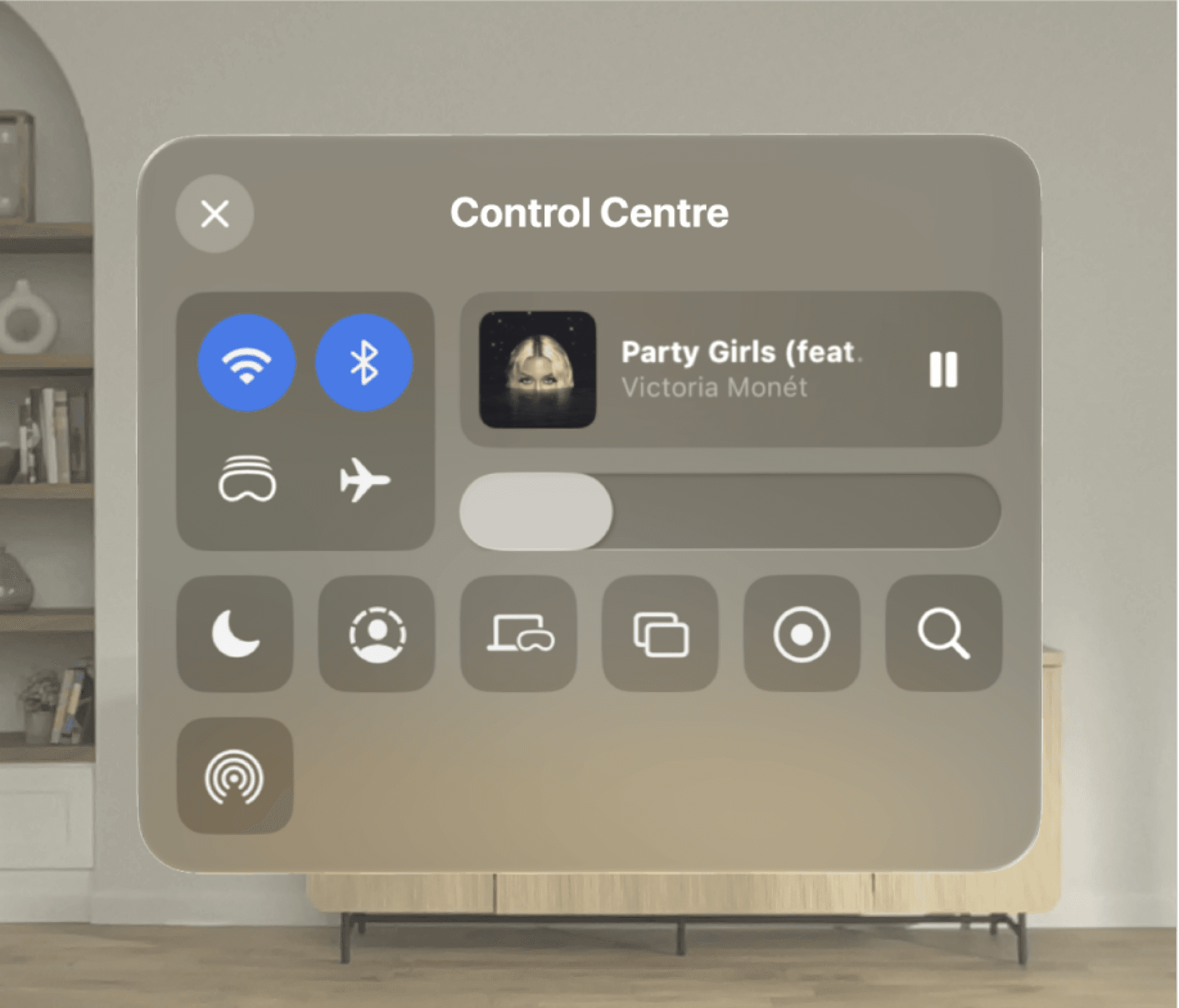
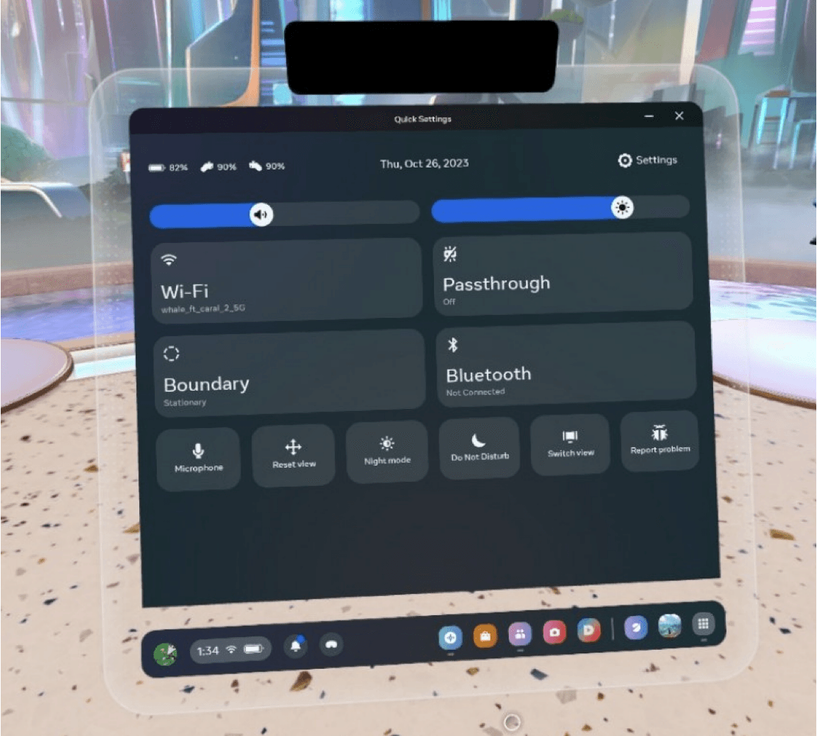
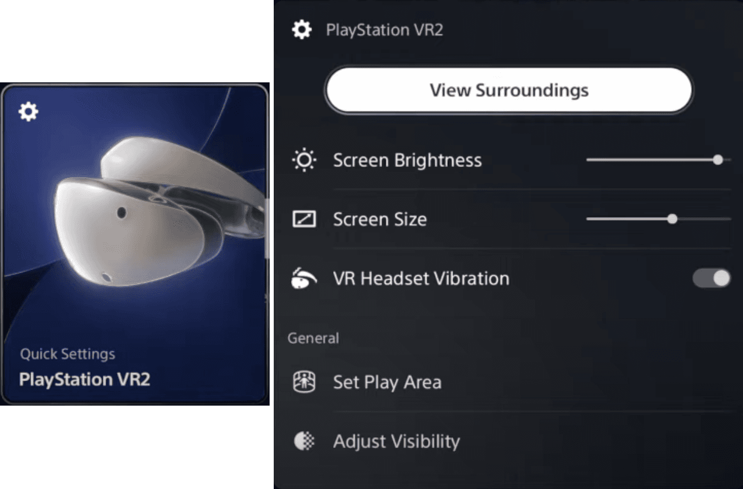
Analysis into the Vision Pro, Quest, and PSVR2.
Their control center is based off the mobile and desktop layout, ensuring familiarity for the user in an already unfamiliar environment (mixed reality).
Their control center’s buttons and sliders are large for accessibility.
The control center is small and non-confrontational requiring less multi-interactions needed to achieve desired results.
The control center still affects the user’s immersion in mixed reality, as it creates a pop-up window that overlays the user's experience.
The control center still requires laborious movements, although eye tracking is helpful in calling the center.
The center cannot be accessed and closed quickly. There are no gestural motions that could be used to close the window.
Buttons are large and features are clearly labeled.
Functions are easily accessed without too many multi-interactions once inside the quick settings window.
Clear hierarchy of information, although possibly a bit too forced.
Not clear as to where quick settings is accessed from. Requires precise actions in order to access it, as pinch and point is laborious and exhausting.
Interferes with the immersive experience as its a large, opaque window
Lack of customization and features.
The quick settings are intuitive. There is a clear hierarchy of information with headings.
Passthrough is clearly accessed and explained through text as well.
The quick settings location is clear.
Requires two interactions in order to access settings
There is a lack of features in the control center
Button sizes are small, once again leading to laborious movements. The sliders are small which requires delicate movements (although mitigated with a controller).
Breaks immersive experience entirely.
Research
Developing a Solution
Accessibility
The control center redesigned with accessibility at the forefront. Windows should be kept close to the user to avoid laborious movements. Gestures to call the centre should be quick and intuitive.
Functionality
The control center should have all of the functions one may need for quick changes, as well as options for customization. It should not disrupt the immersive experience and thus should be small in size.
Design Goals
A control center that is called upon through hand gestures
The window should be designed that is small and easily navigated
It should not break the immersive experience
Accessible navigation
The control center provides information about the current actions the user is doing
Ideation
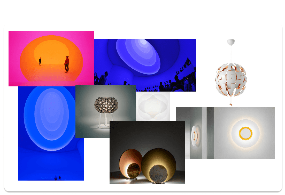
Moodboard
Considering XR Design Systems
I researched different control centers and their designs in order to make the app in an unfamiliar environment (mixed reality) feel familiar. I also included a limited color scheme in order to make the app versatile across devices.
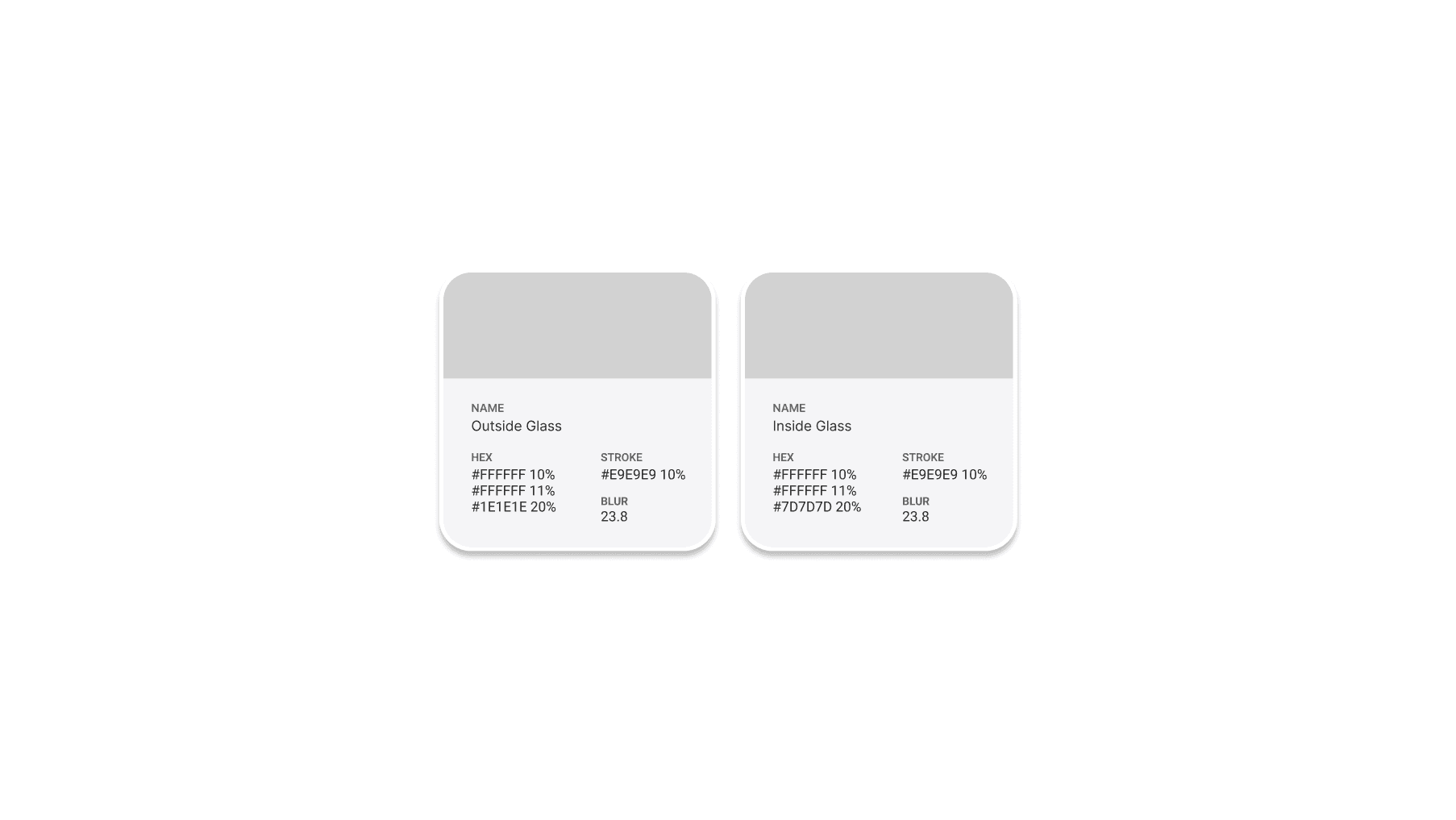
I used a design system that I had created in another project (you can see it in my portfolio).
Shadows and how lights interact in 3D environments.
Bringing information to your fingertips. How does this look?
Ideation
Low Fidelity
Low Fidelity Phase
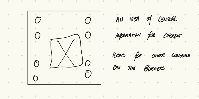
Here are my thoughts about how a control center should be designed. What are the important features. What do we think about when we use a quick settings window?
First I experimented with how a centralized window would look.
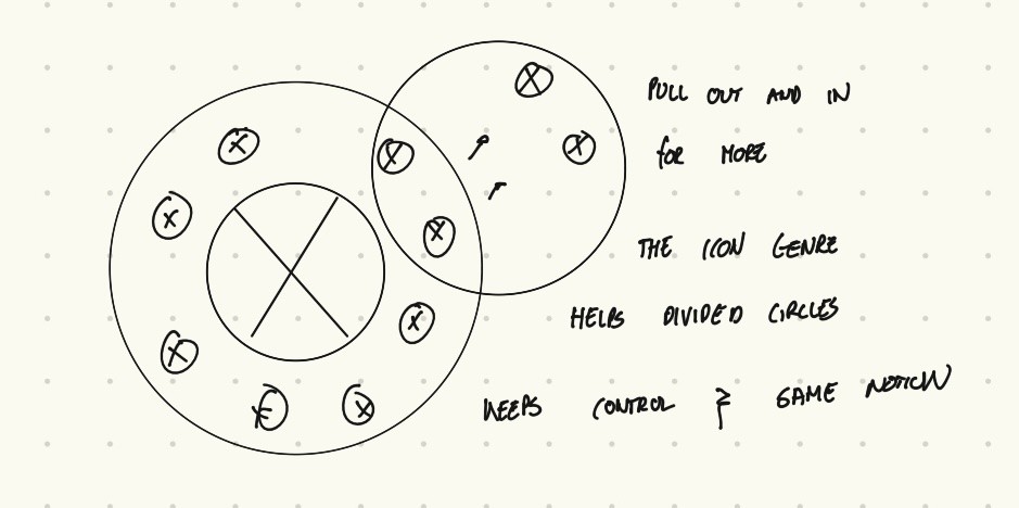
Then I divided icons into genres. This made me realize how the shape could now move dynamically.
Dynamic movement worked very well for this idea. It also utilized the 3D space of an AR/VR experience.
Ideation
Mid Fidelity
Mid Fidelity
This stage was focused on ensuring the user experience of cooking in spatial environments aligned with the user needs of accessibility, multitasking, and hands-free interaction.
I liked the idea of a centralized focus to the design.
The centralized circle allowed for both focus and aesthetic appeal.
Ideation
High Fidelity
High Fidelity
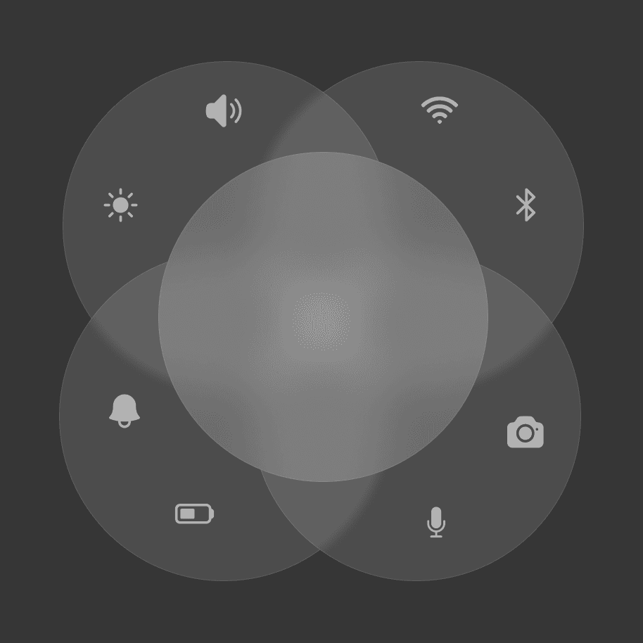
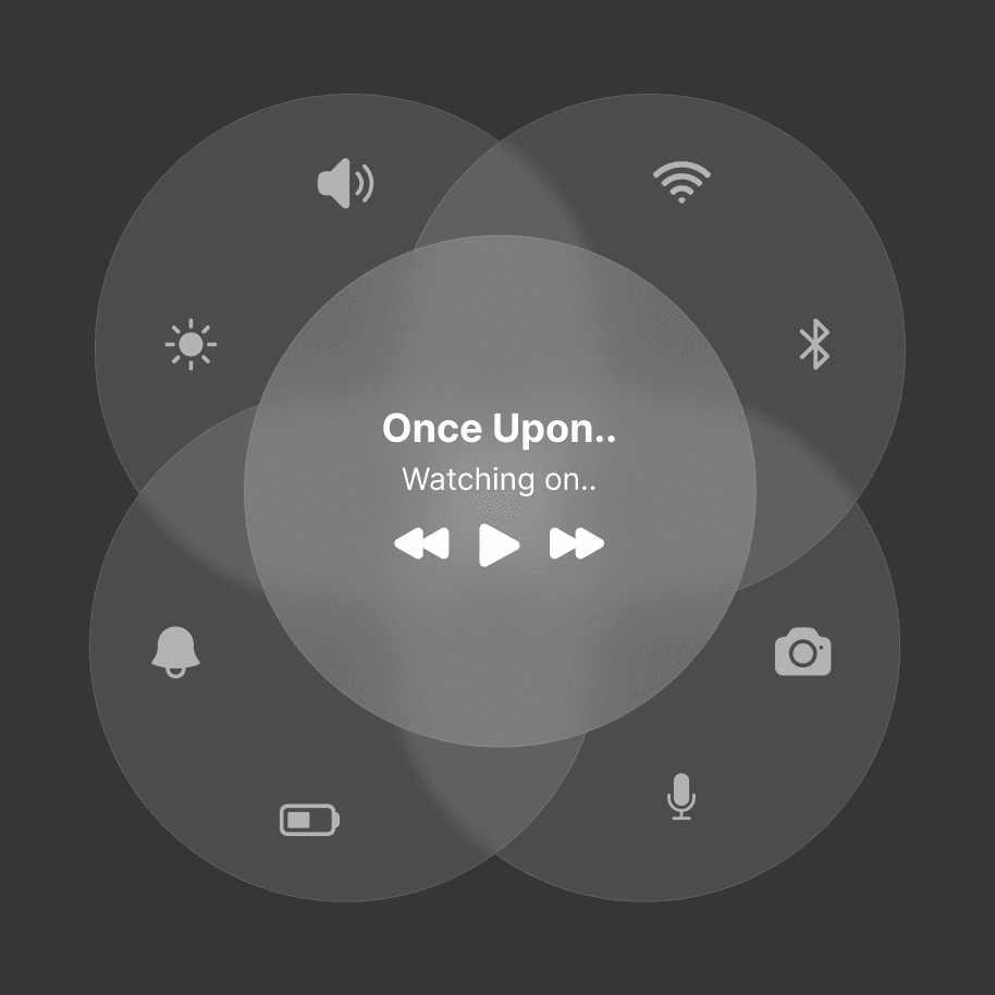
These high fidelity concepts showed a control center that would focus on the glassmorphism style, although have distinct circular design paradigms. I also ensured there was an emphasis on movement and fluidity to make the window feel natural - and most importantly intractable.
The natural opening of a flower is intuitive. Design follows nature.
Based on the central window of current quick settings (mobile).
The weight of the transition conveys how the circles are interactive.
Ideation
Design Decisions
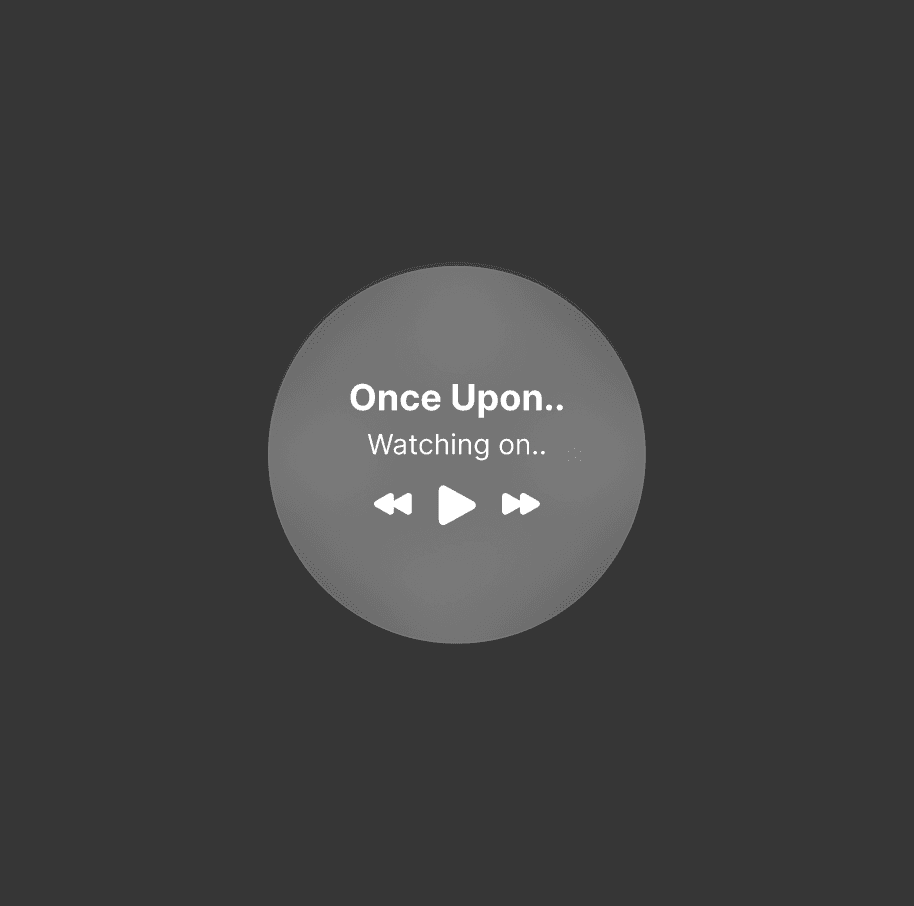
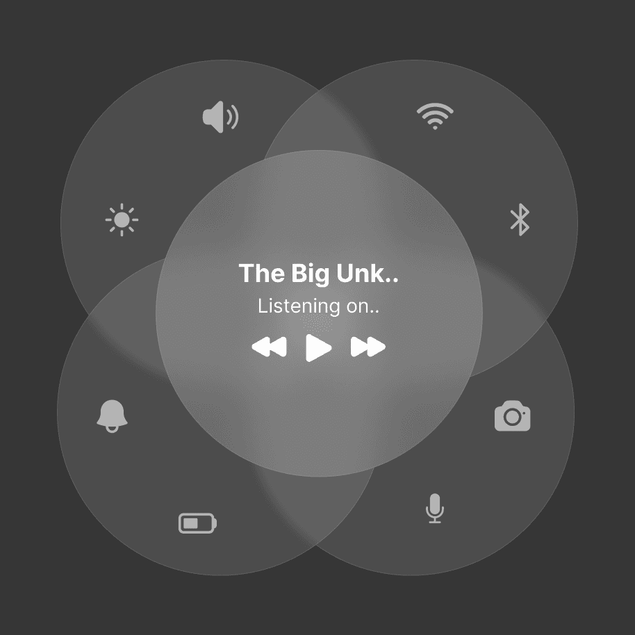
I made sure that the center circle could be used to communicate many different concepts depending on what the user is currently doing. This functions similar to mobile and desktop control centers.
By allowing the user to play with the control center in 3D, the spatial environment is utilized better. Furthermore, it prevents the introduction of new windows, and allows the user to be quick with their actions. The close arrow being outside of the circle is meant to act as a nudge to show users that they can close the control center window by clicking outside of it. This can slowly be removed from future versions once users are comfortable.
Similar to mobile and desktop, users should be able to turn off controls just by tapping as a toggle.
Prototype
Prototyping in Unity
Prototyping the app design using various gestures and actions
Demo in Quest 3
The control center is close to the user, allowing for easy hand interactions that don't require stretching an arm out, or laborious point and pinches.
The control center is also large enough to be readable and easily interacted with. The button toggles are large, important for VR.
The user must learn the double pinch gesture in order to call the control center. This is unintuitive for first time headset users.
Moreover, it may be found irritating that the control center tracks the user's hand, which can lead to stability issues. - Although constraints on rotation and position can fix this.
The center is quickly opened and closed allowing for fast interactions for the user. This is similar to the control centers on mobile.
Minimized the amount of interactions required to use the control center
The user may accidentally close the center without intending to since its a simple action. However, the learning curve for this gesture is low.
The center can move towards the user allowing them to interact more easily with the buttons.
There is more control for the user in determining what works best in their environment. It's also just cool.
It can be exhausting to hold you arm outwards for long durations of time. Although since the control center only deals with quick actions, this should not be a massive issue.
Allows the center to be moved more dynamically for the user's needs.
The user has better accessibility as the center can be larger or smaller. The user can also interact with both hands.
Can be overwhelming as the panel is no longer locked in place.
Different mechanisms for closing the center are needed.
Conclusions
Main Takeaways
Design Takeaways
This project led me to an appreciation of the light and space movement, particularly works by James Turrell. After seeing his work, I felt that this was a design ethos I wanted to base my spatial computing designs around.
I also learned that design needs to place the user first, always. Design can also evolve, and small interactions can slowly be removed after users become comfortable with them.
Technical Takeaways
I learned prototyping in Unity is extremely difficult and requires patience. I also learned that scripts used correctly, such as a LeanTween library, can provide powerful results.
I hope to improve my C# skills in the future so I can prototype much faster and shorten the feedback loop.
Next Steps
I wanted to explore alternative ways of calling the control center - through UI, other gestures, or controllers.
I also wanted to explore how this control center shape could be used in other parts of spatial computing UI, creating a design ethos throughout.
Also, where could a small AI assistant fit into this control center?
Thanks for checking it out!
