Design + Full Stack Development
Simplifying RPA Data with a Custom Analytics Dashboard
Designing, building, and shipping a software enabling more comprehensive, accessible, and customizable data analysis into the company’s database.
Process Highlights
Overview
Overview
During my internship at Apollo Studios, another intern and I were tasked with analyzing a database containing over 4 million entries to generate insights for both internal use and client purposes.
Our initial challenge was to develop a script capable of analyzing the data, followed by producing analytics based on specific requirements set by the company and, in some cases, the client.
We built a data analytics dashboard, that provided insights to both clients and internal stakeholders. I also had to build the product.
Timeline
Summer 2024
Team
Product Manger, Data Science Intern, Product Design Engineer Intern

Apollo Studios
Apollo Studios is a startup that builds primary robotic process automation solutions for businesses. They also do solutions architecture and develop custom software for clients. I also had to build the product


Research
Where Are We Currently?
The Audit of the Process
We spoke to clients and internal stakeholders about how they felt about the process. We then measured how long it took them to accomplish certain data goals.
Research
Analysis
The Current Situation
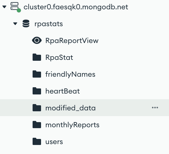
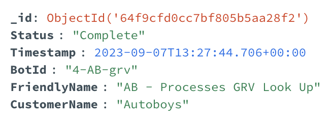
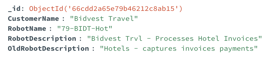
Apollo Studios operated on a MongoDB database that was accessed through MongoDB Compass. This software was beneficial in searching for client names, bot names, and a time period, although it was very inaccessible to understand. The software also did not provide easy, comprehensive analysis that one could just glance at and understand the data
Our Audience: Client and Company
Both the client and executives at the company wanted a solution to this problem, whereupon customers could easily understand how their RPAs were performing, and the executives could isolate which areas they would like to work on.
Overall, the main problem was accessible understanding of the database. It needed a clean, frontend interface. We were designing for two different audiences - with two different needs.
Low accessibility of the data
Clients could not view the data on their own time
No comprehensive insights
Data was visually incomprehensible
Slow customization of data searching
Lack of aggregate performance data
For Apollo, they struggled to get aggregate data comprehension without long MongoDB searches.
The current process of understanding RPA data for Apollo


What were the problems?
We conducted some user research and wrote our findings
Insights needed to be fast
People wanted aggregate data insights
Data needed to be customizable
Research
What data do we currently need?
Format
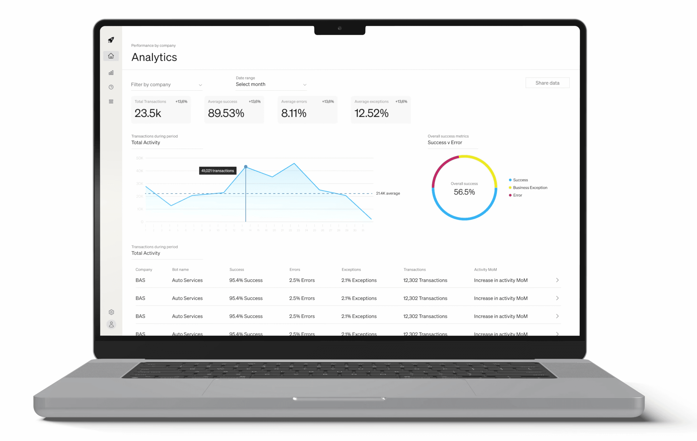
We started by focusing on simple data elements, metric cards, a data table and visual elements for more detailed information.
The three main data visualizations
Bot names for specific companies
Status organization of bot transactions (success, failure, business exception)
Activity by bot and company - searchable through date ranges
Development
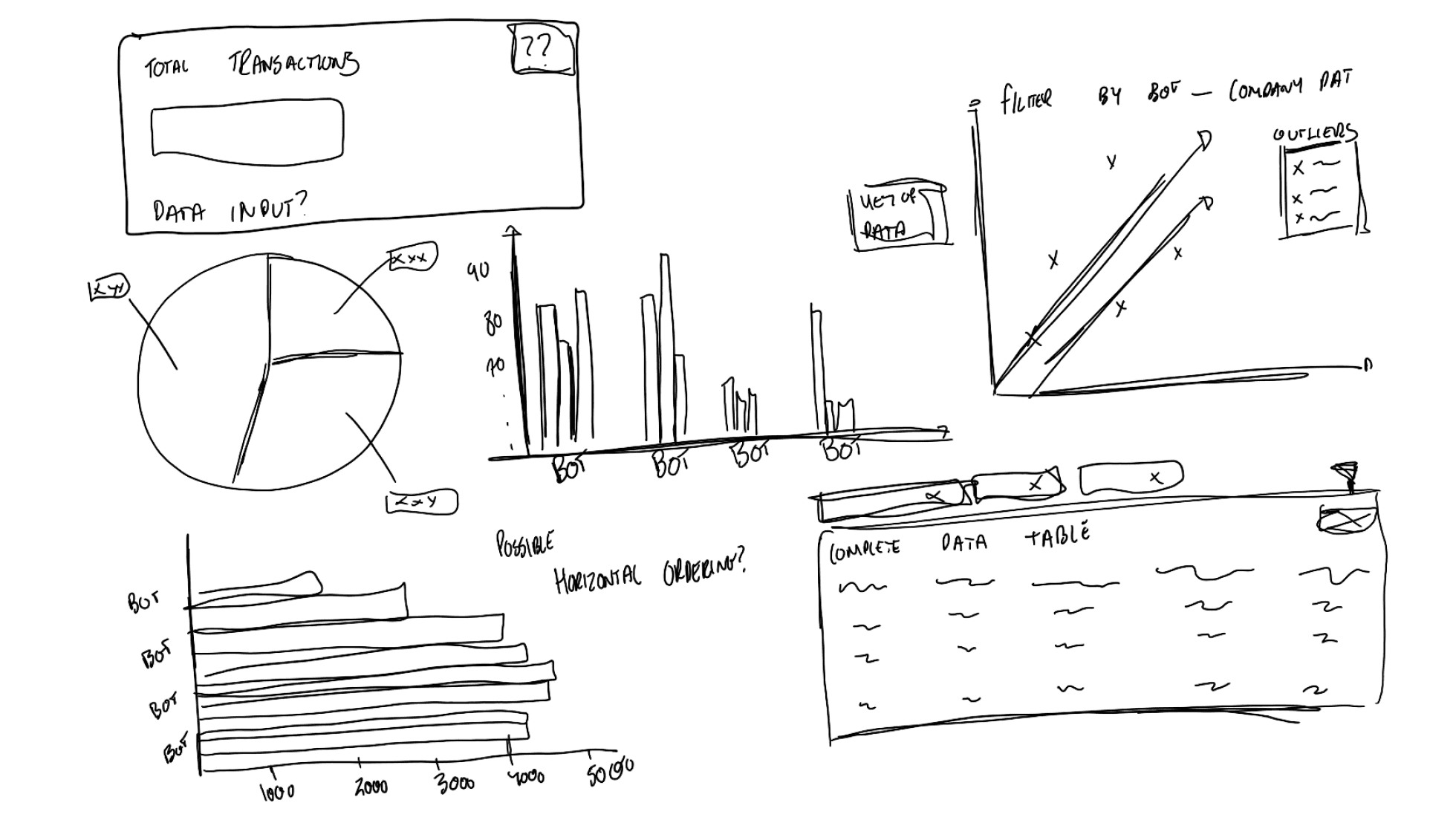
Initial Wireframes and Feedback
We wanted to figure out how the data should be laid out
So we built a small wireframe prototype, using a strong information hierarchy of what was most important to the stakeholders: bot successes, bot transactions, and bot failures.
At a glance, users found it easy to see:
+ Overall bot metrics (success, failure)
+ Transactions by bot
+ Basic detailed information on each bot
Clients would be overwhelmed
However, Apollo Studios felt the clients would be overwhelmed by the amount of data and visualization.
We were building a product for two different audiences, how could we make sure both were satisfied?

Development
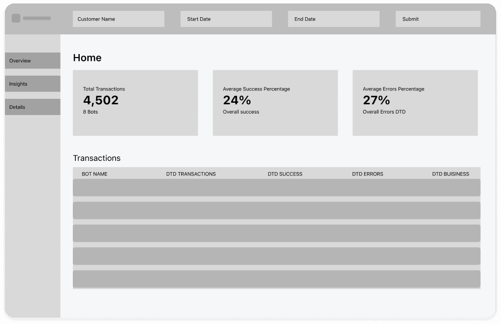
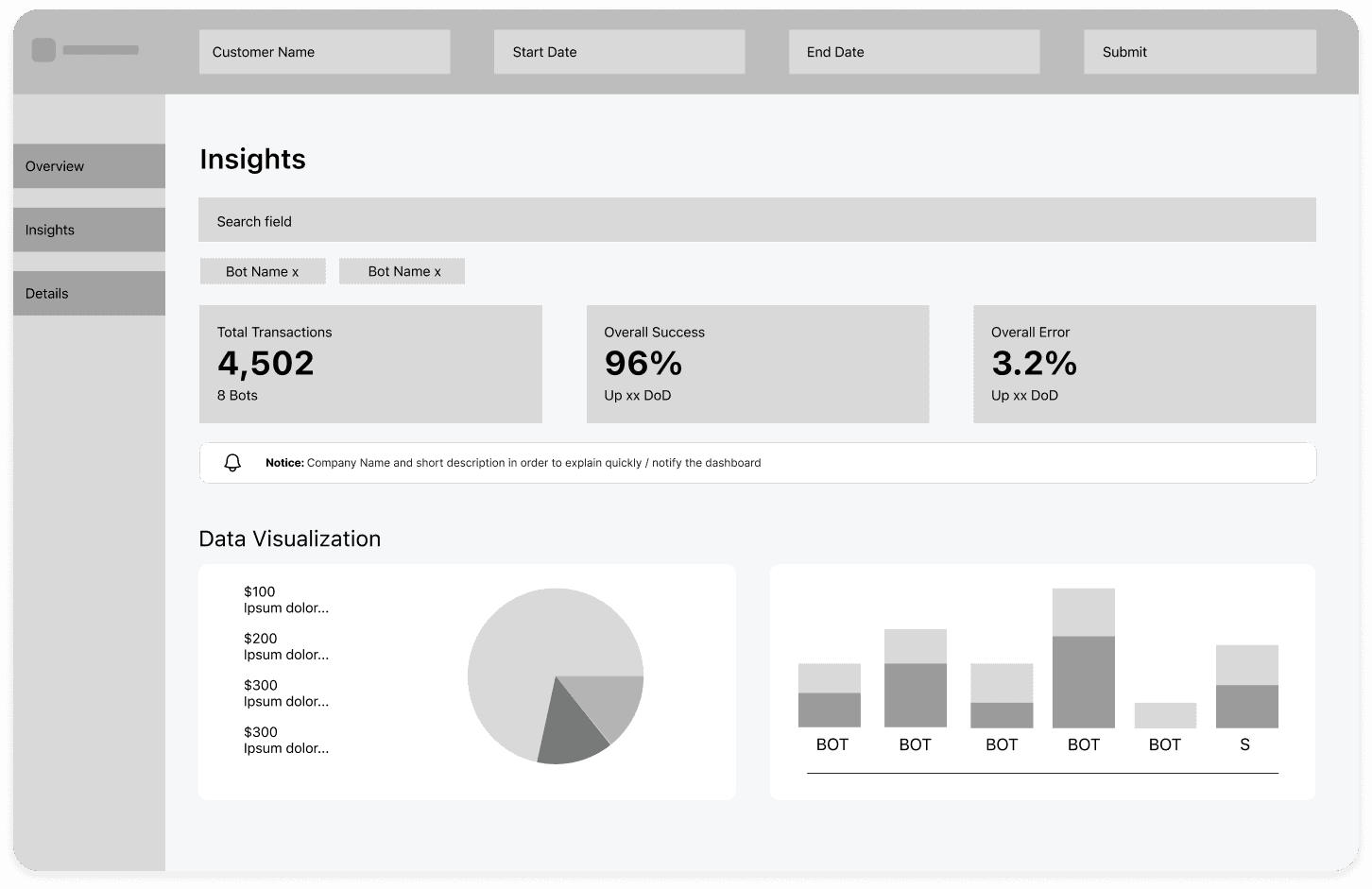
High Fidelity Designs & More Iterations
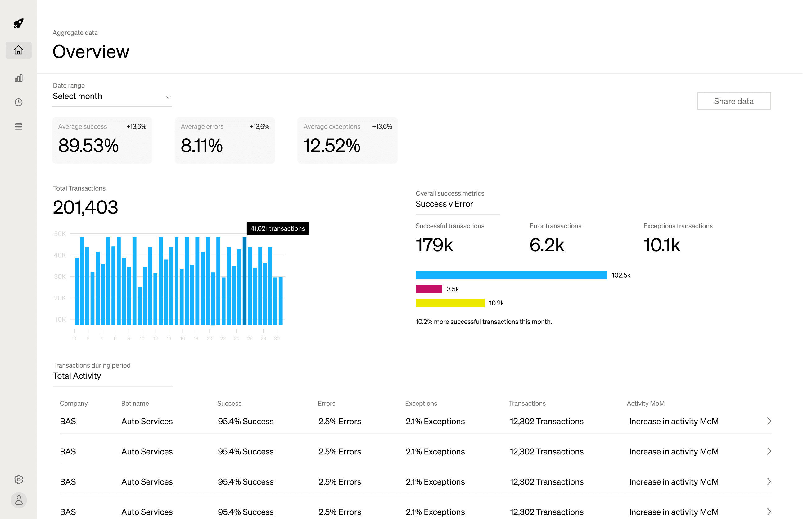
Overview and analytics pages
I reworked the dashboard to have Overview and Analytics pages to highlight what mattered most: Success, Errors, and Business Exceptions. The original layout buried these critical metrics under a flood of numbers, so I elevated them visually and reduced the surrounding noise.
UI Changes to the Dashboard
Instead of stacking multiple bar charts, I moved unnecessary bot data -along with its confusing, database-driven labels - to the dedicated Bot Performance page, ensuring clients didn’t have to parse irrelevant information.
A smoother gradient line graph replaced the second bar chart, making it easier to compare trends at a glance. By consolidating essential data in a single view and relocating the rest, I created a more coherent experience that puts the user’s most pressing concerns front and center.

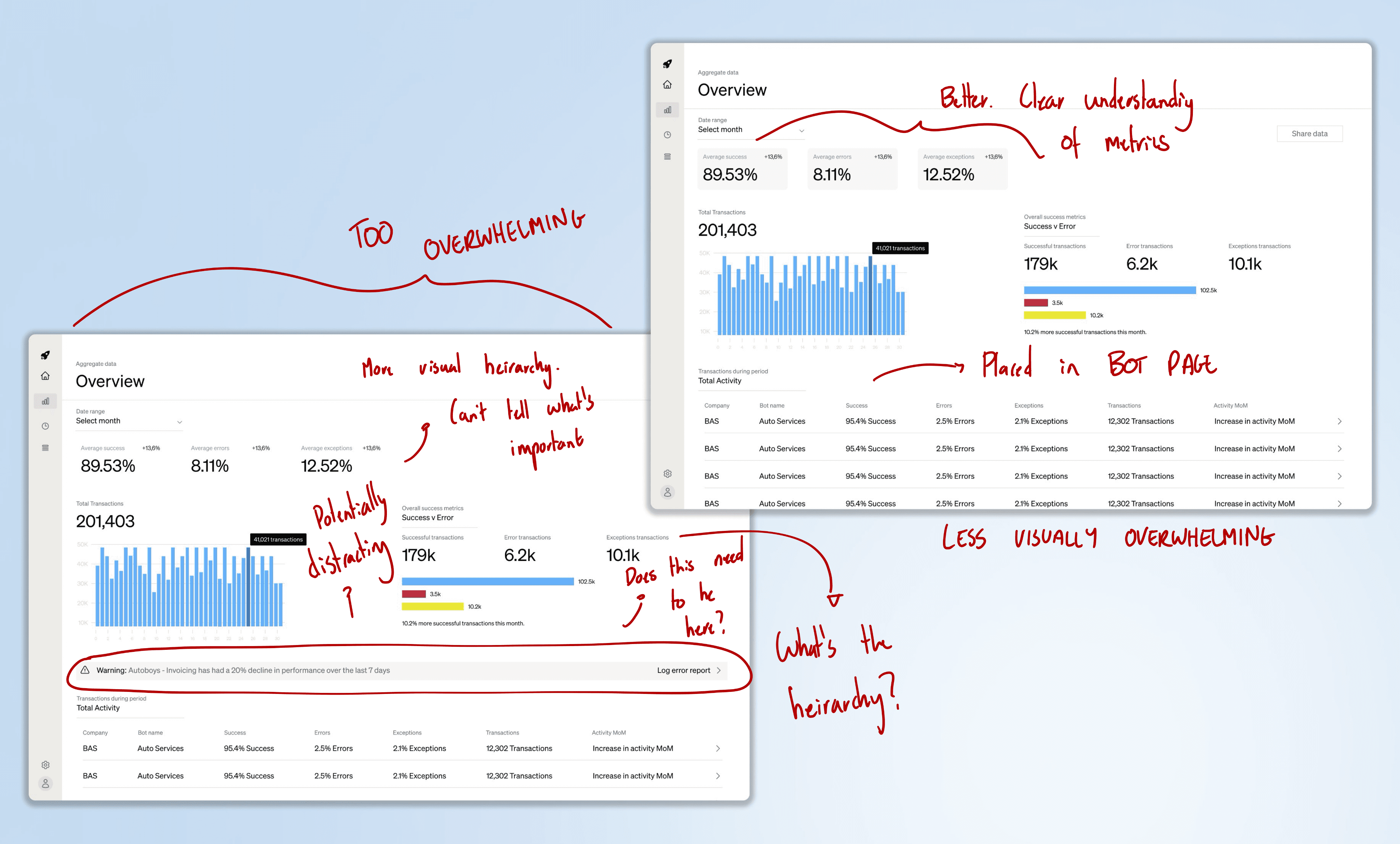
Overwhelming the user
The first two high fidelity iterations had to have improvements because there was just far too much data.
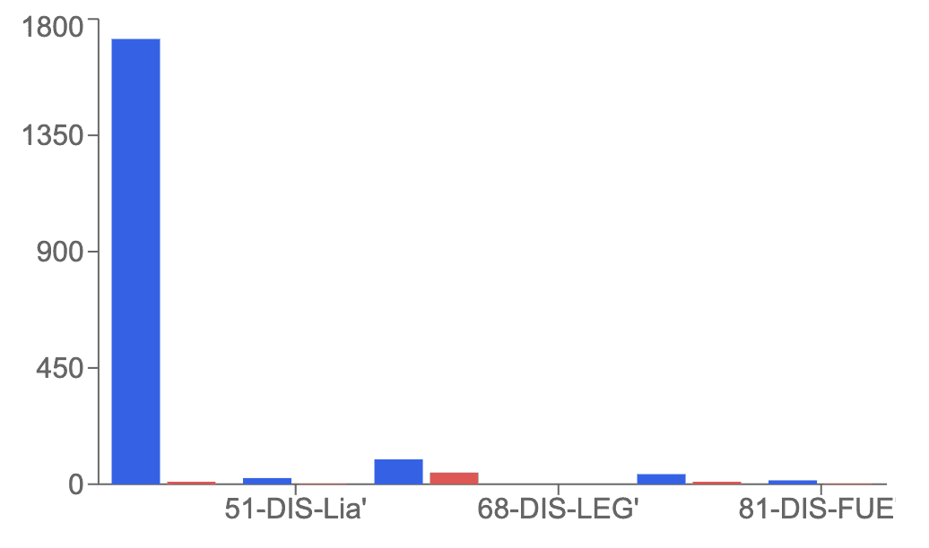
Graphs and data visualization
We had to rethink what type of charts we were using - what leant itself best to transaction periods?
Creating more pages
We needed to make pages for data analytics and error analysis - these provided more detailed information for internal purposes.
Development
Final Designs
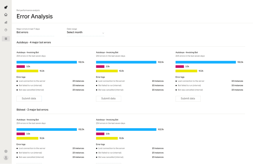
An error failure and bot transactions page
The error page would categorize and log major errors, showing how frequently each occurs over the last seven days. It helps users prioritize the most common error types and implement focused resolutions.
The bot transactions page highlights metrics for individual bots, illustrating trends in success, errors, and exceptions at a more granular level. Additionally, it flags significant performance drops, allowing teams to quickly isolate and address potential issues.
Simplification
Although these two pages were useful, we never developed them ourselves. Most of the development of the dashboard was done by me, and I lacked the time to build these last two out. The team is currently working on them now.


Conclusion
Takeaways
Stakeholder Outcomes
Executives at Apollo Studios achieved their goal of being able to access data insights into an otherwise incomprehensible MongoDB database.
RPA engineers were able to understand the reasons why their bots were failing and which bots were underperforming.
Clients were able to quickly access realtime updates about their RPAs at Apollo Studios and their performance.
Collaboration
I worked alongside another intern from UC Berkeley who specialized in the backend data science of the project, and we formed a great team in helping each other build the dashboard.
I realized it is important to understand the process of building a product end-to-end so that it can be as cohesive as possible. This gave me renewed appreciation for CS knowledge.