Design + Full Stack Development

Design + Full Stack Development

Simplifying RPA Data with a Custom Analytics Dashboard

Simplifying RPA Data with a Custom Analytics Dashboard

Designing, building, and shipping a software enabling more comprehensive, accessible, and customizable data analysis into the company’s database.

Designing, building, and shipping a software enabling more comprehensive, accessible, and customizable data analysis into the company’s database.

Process Highlights

Design Overview and Challenges

Overview

During my internship at Apollo Studios, another intern and I were tasked with analyzing a database containing over 4 million entries to generate insights for both internal use and client purposes. Our initial challenge was to develop a script capable of analyzing the data, followed by producing analytics based on specific requirements set by the company and, in some cases, the client.

Additionally, we were responsible for setting up a scheduled, automated email system that would deliver personalized insights to clients regarding their RPAs. We were also asked to create a front-end software solution that could visually present the data and allow for customizable analysis.

To accomplish this, we began by creating a Python script to scrape the MongoDB database. We then developed a Flask-based Python backend and a React frontend, hosted on AWS, to provide clients and employees with customizable, accessible insights into the current status of their RPAs.


Process Highlights

Project Information

Timeline

July 2024 - August 2024

Skills

Figma, Mongo, Python, React

Internship

I worked alongside one other intern who primarily handled the data scrapping from MongoDB and the email automation.

Timeline

July 2024 - August 2024

Skills

Figma, Mongo, Python, React

Internship

I worked alongside one other intern who primarily handled the data scrapping from MongoDB and the email automation.

Research

The Problem with Current Data Insights at Apollo Studios

The Current Situation

Apollo Studios operated on a MongoDB database that was accessed through MongoDB Compass. This software was beneficial in searching for client names, bot names, and a time period, although it was very inaccessible to understand. The software also did not provide easy, comprehensive analysis that one could just glance at and understand the data

Client and Company

Both the client and executives at the company wanted a solution to this problem, whereupon customers could easily understand how their RPAs were performing, and the executives could isolate which areas they would like to work on. Overall, the main problem was accessible understanding of the database. It needed a clean, frontend interface.

The End to End Process

We quickly realized that in order to make a comprehensive dashboard, it would require a backend script to analyze the data from Mongo, and then a front-end hosted on AWS to be provided to clients and executives.

Research

The Current Problem

Inaccessible Data

MongoDB Compass had to be installed in order to get any insights into the data. It required a system set up, and then a short onboarding on how to use the software. The query function was difficult to use and often resulted in frustration as you had to have very specific input parameters.

Client Facing Front-End

There was no available front-end that a client could access so they could get customizable insights into their data. Before we began on this project, clients would receive a report with numbers that were generated by hand, and could not be tweaked to get insights about individual bots or time periods.

Lack of Customization

Customers and executives could not easily customize the time period, bot selection, and company selection to get customizable insights into the data set. Doing so in MongoDB wouldn't provide comprehensive insights. They also did not have clear visual data which would enable them to understand what areas needed improvement and what areas were excelling.

Insights

There were no insights into the data that could be easily presented. Simple data analysis such as an average error percentage, or which bot was performing the best was inaccessible. Moreover, even generating a list of all the bots each company had was not set up yet. We needed to both create and present insights into the data for our audience.

Inaccessible Data

MongoDB Compass had to be installed in order to get any insights into the data. It required a system set up, and then a short onboarding on how to use the software. The query function was difficult to use and often resulted in frustration as you had to have very specific input parameters.

Client Facing Front-End

There was no available front-end that a client could access so they could get customizable insights into their data. Before we began on this project, clients would receive a report with numbers that were generated by hand, and could not be tweaked to get insights about individual bots or time periods.

Insights

There were no insights into the data that could be easily presented. Simple data analysis such as an average error percentage, or which bot was performing the best was inaccessible. Moreover, even generating a list of all the bots each company had was not set up yet. We needed to both create and present insights into the data for our audience.

Lack of Customization

Customers and executives could not easily customize the time period, bot selection, and company selection to get customizable insights into the data set. Doing so in MongoDB wouldn't provide comprehensive insights. They also did not have clear visual data which would enable them to understand what areas needed improvement and what areas were excelling.

Research

Personas - Who is this made for?

Executive at Apollo Studios

Specifications: Understanding their company’s data, both on a high and low level

Challenges: Could not easily understand the MongoDB database without downloading software and going through an onboarding experience.

Could not gain insight into a lot of data very quickly, as it required them to do long searches that didn’t provide comprehensive analysis.

Was unable to easily see which bots were performing well or underperforming to figure out where work was needed.

Client

Specifications: Understanding how their RPA service is performing

Challenges: The client was forced to just accept data presented in inaccessible email formats, often in manually created spreadsheets.

There was a lack of customization in the date ranges and individual bot insights. They also faced difficulty in quickly understanding the statuses and performance of their bots.

They also were dependent on Apollo Studios to provide insights, rather than easily accessing them whenever.

Considering the User

We concluded that the goal of this dashboard was to provide easy, accessible insights into the data. It should be presented beautifully (since its client side) as well as comprehensively for both Apollo Studios internally and the client. We emphasize accessibility as our main philosophy.

Research

So… The Main Problems:

Main Problems with Current Data Insights

Lacked accessibility in generating insights without an onboarding process / software

Data could not be viewed at the client’s discretion without contacting Apollo Studios

There were no comprehensive insights into the data that aggregated the DB

Data was not presented visually and comprehensively for easy understanding

Research

Developing a Solution

The Backend

We needed to first develop the python script that could analyze the MongoDB database. This involved some iterations in generating insights although this is irrelevant to the current design process.

The Frontend

We decided the front end should be accessed through a web browser, so clients need not download software. This led us to using React, as it was a great library for accessible and beautiful interfaces.

Design Goals

Accessibility for all stakeholders

Generate and present relevant insights

Customizable analysis for clients and executives

Delighting, aesthetic design

Designing and Developing

This project also required me to develop whatever design I created. I had to step into the shoes of a developer, and put in the work to create a delightful interface. This was a great learning (and empathetic to developers!) experience.

Research

The User Journey

Understanding the User Journey

A quick overview of the user journey throughout the interface.

1

User aims to gain insights into the data

Either as a client or executive

2

User searches for company and date range

Companies not customizable for clients

3

User presented with key data and visual data

Average percentages / charts

4

Explore more in depth

Through deeper data

1

User aims to gain insights into the data

Either as a client or executive

3

User presented with key data and visual data

Average percentages / charts

2

User searches for company and date range

Companies not customizable for clients

4

Explore more in depth

Through deeper data

Ideation

Moodboard

Color Palette

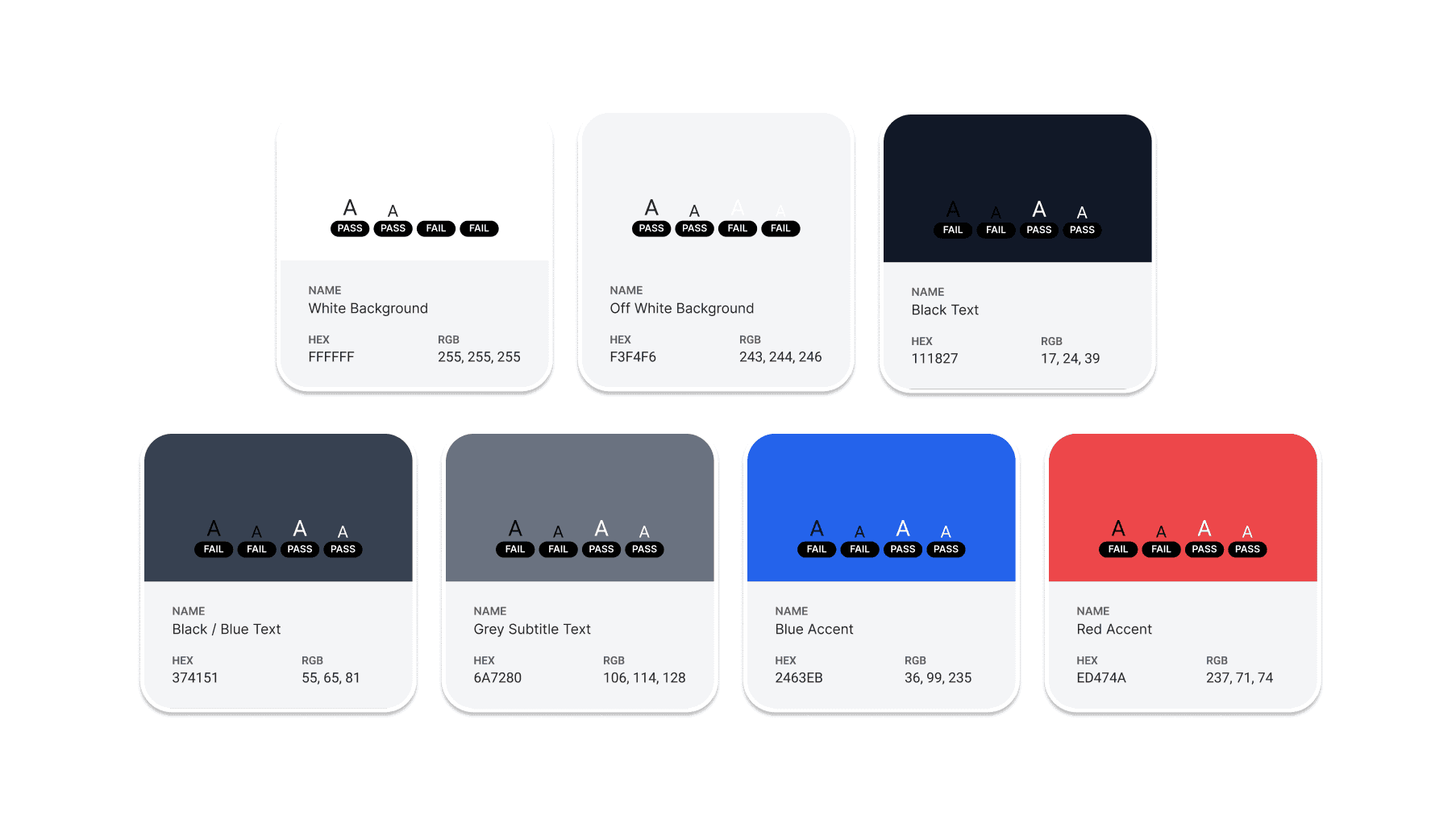
Color Palette

Blue accent color (suggested by supervisors).

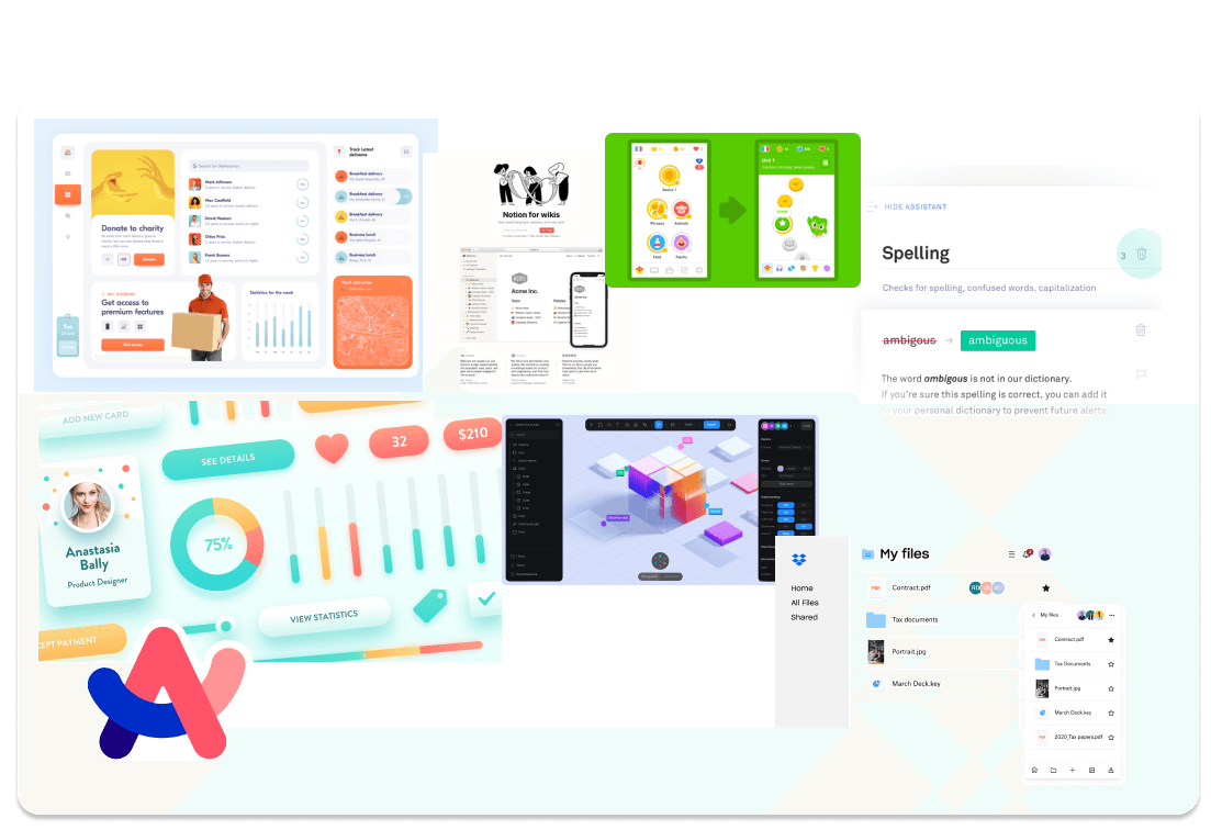
Friendly UI Integrated in Data

Friendly UI Integrated in Data

Because the data can be overwhelming, I made sure the UI would look friendly.

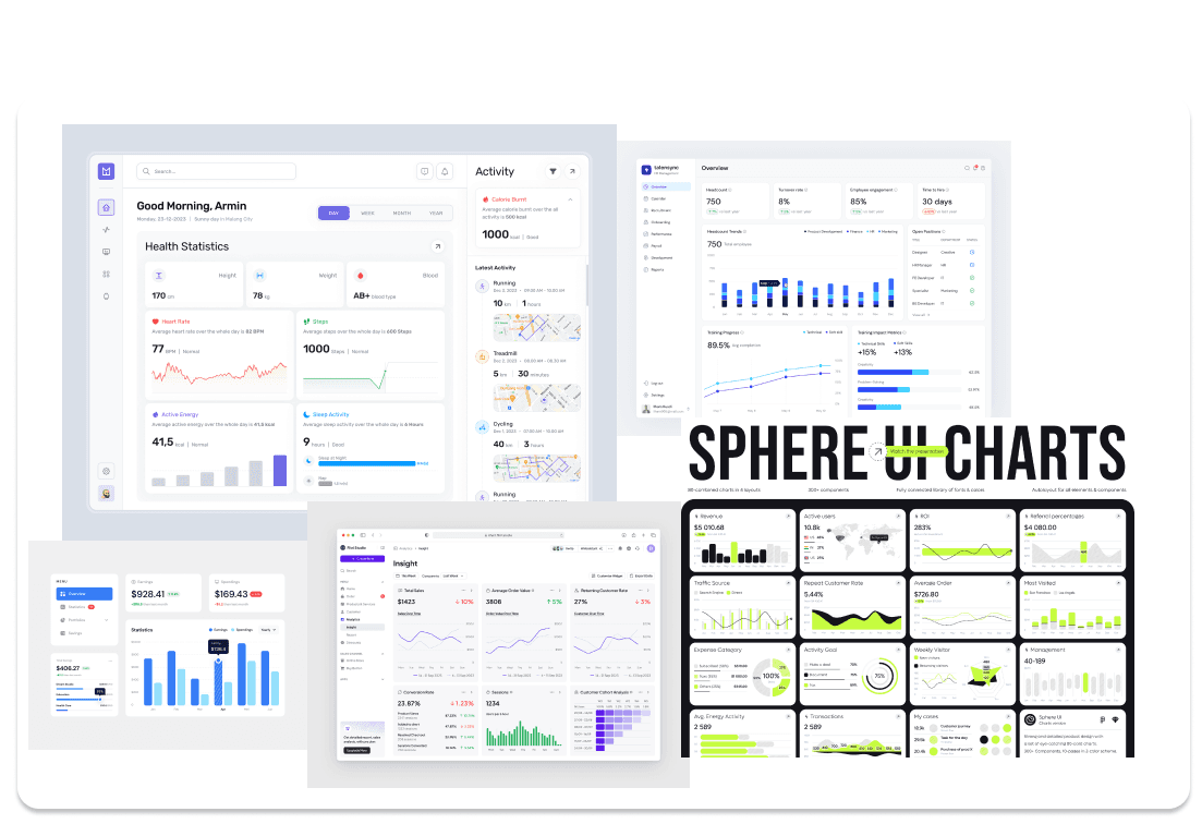
Data Dashboards

Data Dashboards

Investigating different ways of visualizing data.

Ideation

Low Fidelity

Low Fidelity Phase

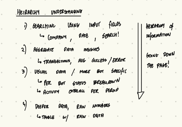
Here I worked with the executives to figure out what data they wanted to include in the dashboard. They explained how they would prefer to be able to access data from the DB, and I responded by showing them quick designs I made.

Began by understanding the hierarchy of information through the user journey.

Ideation

Mid Fidelity

Mid Fidelity

This stage focused on understanding how the information should be presented. I also began brainstorming how to code these designs.

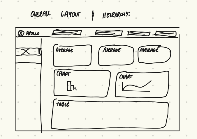
Overall Layout

Overall Layout

I blocked out the overall layout after feedback.

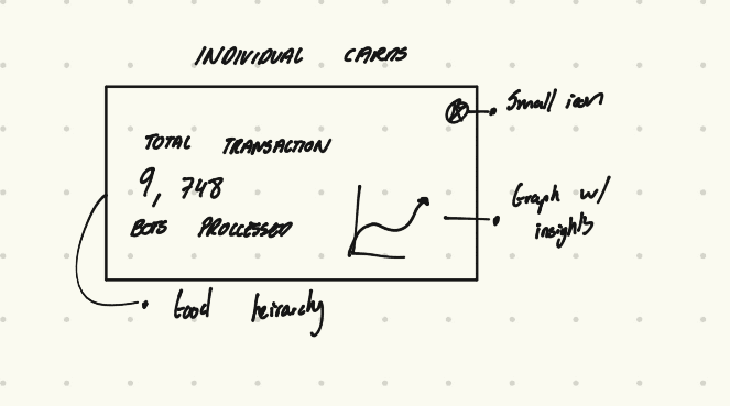
Dashboard Cards

Dashboard Cards

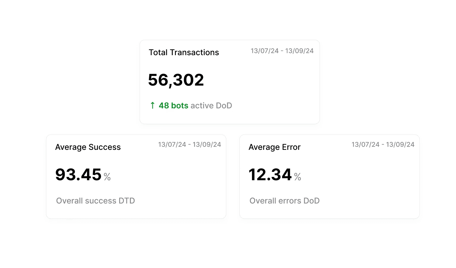
Understanding the main aggregate cards at the top of the dashboard.

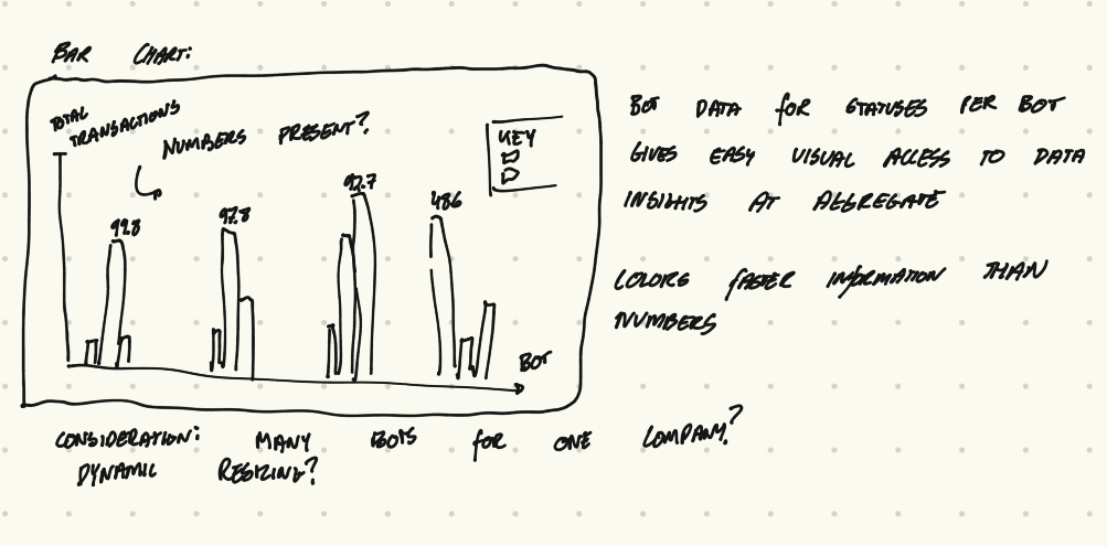
Bar Chart

Bar Chart

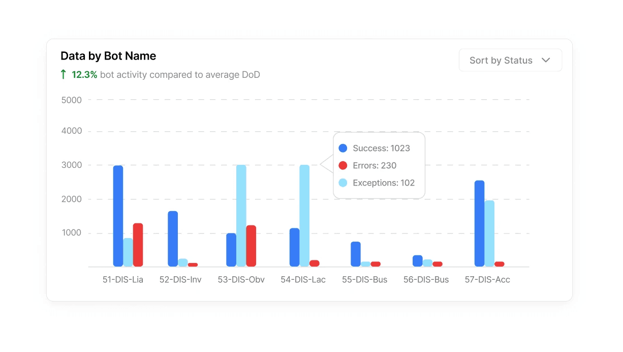
A bar chart. I argued the key was too large and distracting although I was told to include it.

Pie Chart

Pie Chart

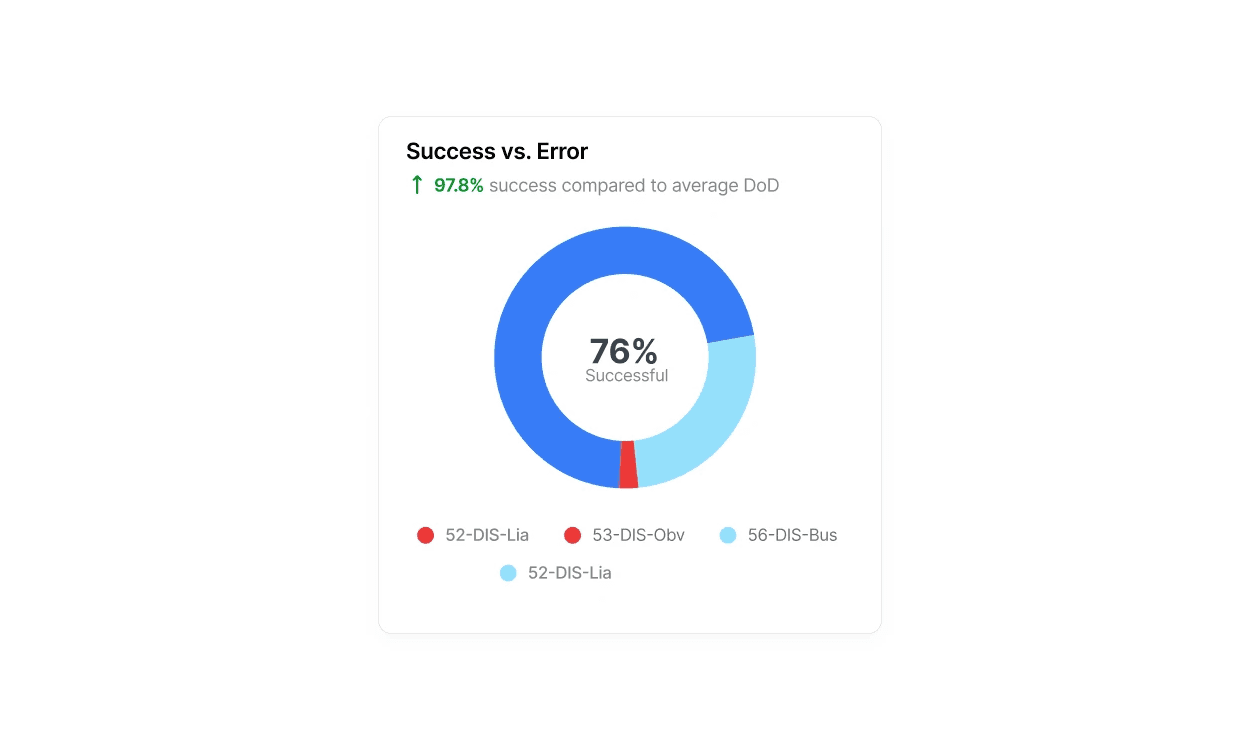
Key alongside.

Sessions Overview

Sessions Overview

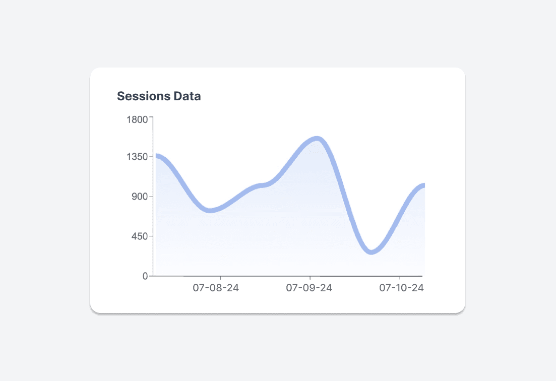
Understanding that this would be a line graph.

Ideation

High Fidelity

High Fidelity

This stage explored what the dashboard would look like. I submitted these designs for review and then would begin developing it.

Dashboard Cards

Dashboard Cards

Feedback: Information hierarchy

Bar Charts

Bar Charts

Feedback: Less playful, keep the key as before.

Pie Chart

Pie Chart

Feedback: Enlarge breakdown details

Sessions

Sessions

Feedback: Remove altogether.

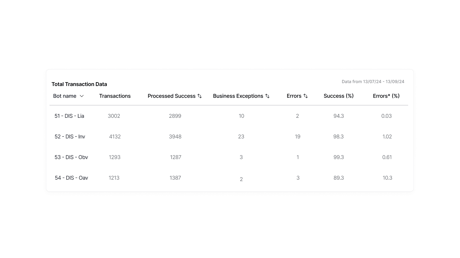
Table

Table

Feedback: Looks good, but ensure it is easy to see the divisions between columns.

Iterations

A lot of these designs went through massive iterations in the development process. I often had to workaround my designs based on my technical ability. Usually, I would try and build what I wanted as best as possible and then review it with my supervisor. This led to many changes in the high fidelity prototypes that are not seen here.

Ideation

Developing my Designs.

Design Goals

This internship required me to follow through with my design decisions by developing them myself. This required me to quickly learn backend development (which I had never used) and also improve my React knowledge. I gained a large amount of empathy for my fellow developer after this project.

The Backend

Myself and one other intern developed a python script that could iterate through all of the data points in the MongoDB. It collected unique statuses and grouped them alongside generating aggregate data insights.

The Frontend

I decided to use React since I knew it best and it would be able to create beautiful frontend UI. I learned a lot about how difficult it can be to turn these design dreams into realities.

Iterating Through Development

Another important lesson I learned is how much iteration occurs through development. As the developer and designer, I ran into problems when I tried to code some of my designs. This led me to going back to figure out different ways of attacking the same idea. I realized that design is not as linear as I had once thought.

Developing and Prototyping

Development

Developing the Dashboard in React

Some elements are removed due to privacy reasons.

Building the Dashboard

Building the Dashboard

Benefits

Benefits

Small micro interactions that show attention to detail.

Considerations

Considerations

Difficult to program.

Development Challenge

Development Challenge

It was in fact, difficult to program.

Conclusions

Main Takeaways

+91% Faster Access to Client Data

From ~35 seconds using MongoDB to 3 seconds using our Data Analytics dashboard.

Increased Transparency to Clients

Developed easier analytics to track performance of the RPAs

Data Cleaned 4 Million Entries

Cleaned all entries with a standardized data naming system.

Faster Workflow

Hosting on AWS meant Clients and Executives did not need to download MongoDB and related apps.

Stakeholder Outcomes

Executives at Apollo Studios achieved their goal of being able to access data insights into an otherwise incomprehensible MongoDB database.

RPA engineers were able to understand the reasons why their bots were failing and which bots were underperforming.

Clients were able to quickly access realtime updates about their RPAs at Apollo Studios and their performance.

Collaboration

I worked alongside another intern from UC Berkeley who specialized in the backend data science of the project, and we formed a great team in helping each other build the dashboard.

I realized it is important to understand the process of building a product end-to-end so that it can be as cohesive as possible. This gave me renewed appreciation for CIS knowledge.

Design Takeaways

This was my first industry design experience. I learned what it meant to design in a team, and receive feedback from supervisors and peers.

I also learned how to design with a clear business objective. It was very enjoyable to have a clear problem and goal, and work my way to a solution.

Technical Takeaways

Empathy for your fellow developer. As I had to build anything I dreamt up, I learned what it takes to actually program something - and make sure it works in many edge cases.

One of the most important design / technical mechanics I learned more about are micro interactions. They should be used sparingly, and only in places where they unexpectedly delight a user. And of course, don't make them impossible to code.

Next Steps

I was aiming to institute a feature where executives could print / save their dashboard analytics to a PDF.

I wanted to try and optimize the loading times inside of the dashboard.

I hoped to add a small chatbot that could help the user understand their data more, and even scrape the data in a customizable way.

Thanks for checking it out!